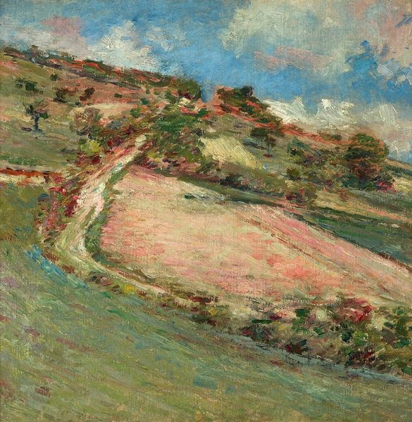
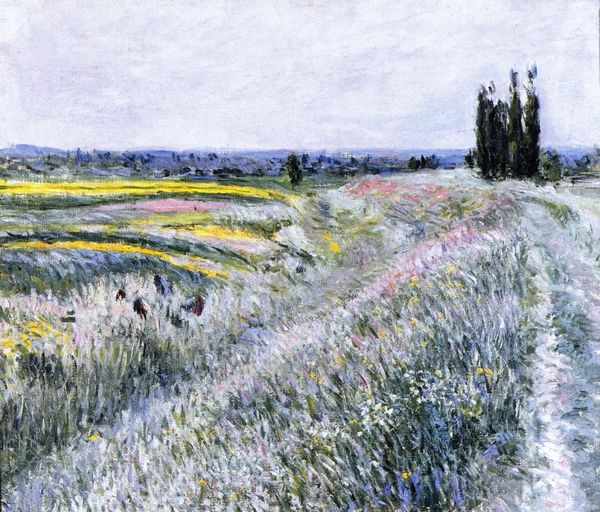
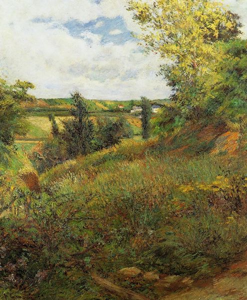
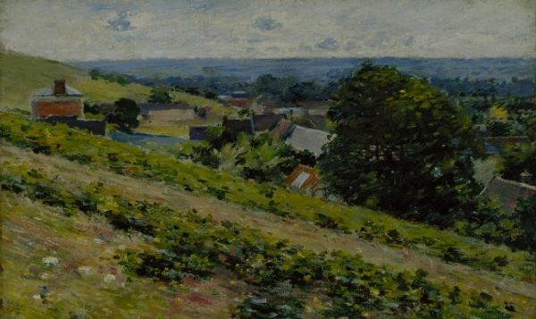
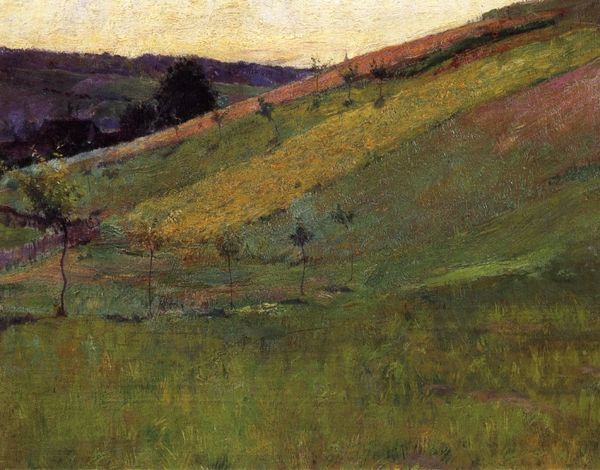
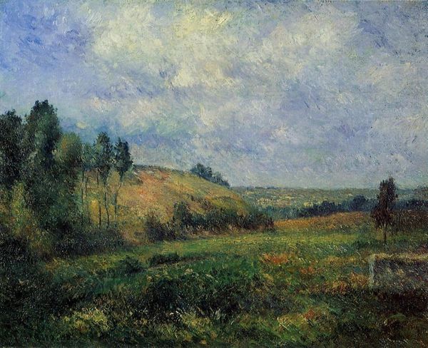
painting, plein-air, oil-paint
painting
impressionism
plein-air
oil-paint
landscape
impressionist landscape
oil painting
Copyright: Public domain
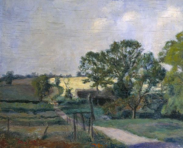
Curator: My initial impression is of a muted serenity; the color palette evokes a subtle calmness, wouldn’t you agree? Editor: Indeed. We’re looking at Theodore Robinson’s "Landscape," an oil painting created in 1889. The artwork reflects the influence of Impressionism with a clear focus on plein-air techniques. Curator: The materiality of paint is especially noteworthy. The composition draws my eye through that winding path, with the texture of brushstrokes capturing the rough feeling of rural terrain underfoot, which invites contemplation and a sense of slow discovery. What's striking is its formal articulation of space via the perspective created solely with layers of ochre and green. Editor: That path also symbolizes more than a physical space. Consider the rise of the middle class, and leisure time in the late 19th century when more people traveled into the countryside seeking refuge from increasingly industrialized urban environments. This painting would fit nicely into that particular historical context. It romanticizes the "rural escape." Curator: Agreed, it’s definitely an escape but what is key, structurally, is Robinson's arrangement of color. Notice the way the brushstrokes direct the eye—the green evokes a peaceful state through the masterful interplay between light and shade across that open field. It all feels precisely calibrated. Editor: Yet, I wonder how the rise of tourism affected actual rural communities, something Robinson overlooks in his pursuit of “pure” landscape art. Whose land is this and who has access? While the artistic method is, undeniably, impressive, it's necessary to examine the socio-political conditions which allow a middle-class painter such freedom while farmers till fields for grueling hours in similarly "impressionistic" light. Curator: An important point! However, purely formally speaking, the chromatic gradation creates not just depth, but also contributes to its contemplative mood. You feel you're walking a soft and peaceful path. Editor: Undoubtedly. Perhaps that's what gives it lasting appeal, beyond its immediate historical context. Its design elements combine with accessible landscape imagery appealing both to connoisseurs and everyday museum visitors. It reminds us about idealized versions of life "out there," while eliding certain truths and making space for imagination instead. Curator: So well said. An impressive use of visual language, no matter how you choose to analyze it!
Comments
No comments
Be the first to comment and join the conversation on the ultimate creative platform.