graphic-art, print, photography
#
graphic-art
#
type repetition
#
aged paper
#
newspaper
# print
#
photography
#
journal
#
fading type
#
newspaper layout
#
stylized text
#
thick font
#
historical font
#
columned text
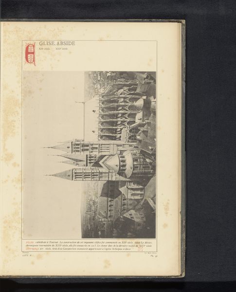
Dimensions: height 59.5 cm, width 44 cm
Copyright: Rijks Museum: Open Domain
Curator: Here, we have what's thought to be a copy of the "Nieuwe Rotterdamsche Courant" newspaper, likely printed between 1940 and 1945. It’s a photographic print, part of a broader graphic art collection. Editor: Oh, wow, there's so much text crammed in here; it almost looks like a meticulously designed grey block! Gives me this immediate impression of information overload during a really turbulent period. You can almost feel the weight of history in the faded print. Curator: Indeed. Structurally, note the classic newspaper layout with its columned text and distinct sections, which aims to compartmentalize the flood of events it conveys. The stylized and bold fonts used for headlines denote an attempt to create visual hierarchy within this density. Editor: I’m drawn to that lead photo dominating the front page—almost feels staged. It captures a certain grimness, I suppose, like a still from a war film that tried too hard to seem factual and objective while selling its underlying, manipulative intent. Curator: The repetition of certain typographic elements underscores a formal consistency across the layout. The effect is that even the act of glancing over an article becomes structured according to visual conventions. Semiotics would call this textual conditioning. Editor: I bet that this old paper, now aging and yellowing with such style, has a lot to whisper to us, about news as a tool, truth bending around political tensions, the way people saw their world shifting rapidly. You get the shivers thinking of this sitting on some poor bloke's breakfast table in those tough times. Curator: It reflects both information dissemination and perhaps subtle manipulation via the control of media presentation during the occupation era. A complex blend. Editor: Exactly. All that official font and stiff reportage versus the reality unfolding. Newspapers...they either lift you up or weigh you down, don’t they? And this one probably did a bit of both back then. Curator: Agreed. Through the art of its design and implicit purpose of its textual content, this newspaper holds layers for continuous interpretation, reminding us about times not always defined by truth. Editor: Right. So much context crammed into one page…kinda gives you a headache when you think about it!
Comments
No comments
Be the first to comment and join the conversation on the ultimate creative platform.
More like this