drawing, ink
#
portrait
#
drawing
#
baroque
#
figuration
#
ink
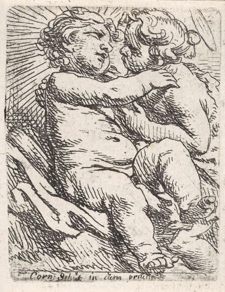
Dimensions: height 65 mm, width 50 mm
Copyright: Rijks Museum: Open Domain
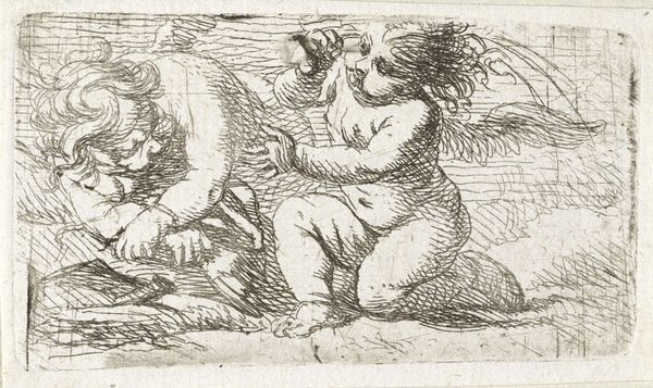
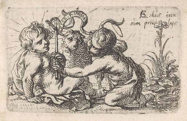
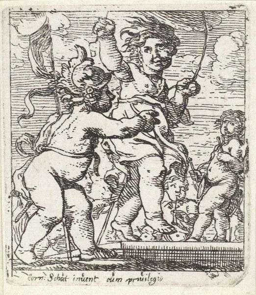
Editor: We're looking at "Christuskind en Johannes de doper," a 1632 ink drawing by Cornelis Schut, currently housed at the Rijksmuseum. There's a kind of rough-hewn charm to it; it feels spontaneous, even a bit playful. How do you interpret the scene? Curator: It feels almost like catching a secret moment, doesn't it? Two chubby cherubs, caught in the middle of what could be sacred play or some kind of divine mischief. What strikes me is Schut’s embrace of the Baroque – it's almost like he is throwing this snapshot directly in the eye of traditional iconography and whispers, “But what if it felt more human?”. Tell me, do you sense that push and pull at all? Editor: Definitely. It’s reverent, but cheeky. The looseness of the lines really conveys that sense of humanity you mentioned. Did this departure from stricter religious imagery happen often during the Baroque period? Curator: The Baroque period definitely reveled in this tension – holding fast to tradition while also poking fun at it with its sense of grand theatricality! Look how these small Gods gaze in opposite directions, both somehow self-absorbed in their activity yet still connected. Do you see that in their interaction, perhaps hinting at their connected but diverging destiny? Editor: It's almost like they're in their own separate worlds, even as they're physically connected. I guess I hadn’t noticed that tension. Curator: Exactly! Art has an exquisite way of mirroring our existence and our tensions, and the human capacity to exist in dual worlds. Editor: Thanks; I'll never look at a Baroque angel the same way. Curator: My pleasure! And hopefully, next time you come across a Baroque piece, you will get a feeling about both the divinity and the humanity within it.
Comments
No comments
Be the first to comment and join the conversation on the ultimate creative platform.
More like this