drawing, paper, ink
drawing
script typography
paper
ink
genre-painting
academic-art
calligraphy
Copyright: Rijks Museum: Open Domain
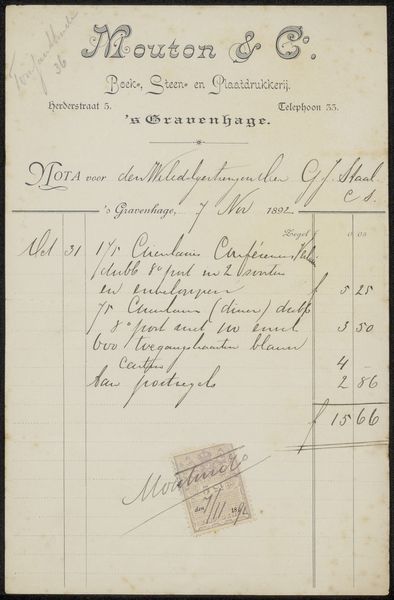
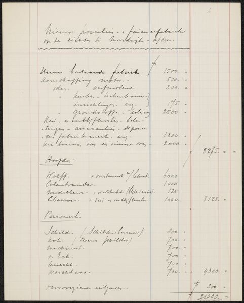
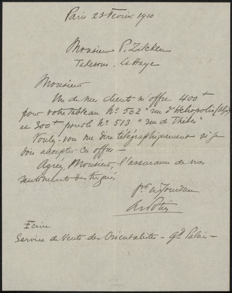
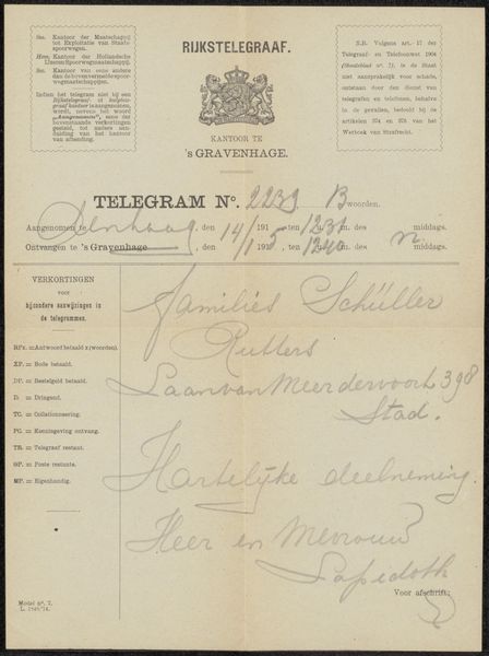
This is a bill, "Nota aan Philip Zilcken," created in 1894 by Mouton & Co, a printing company. At first glance, the eye is drawn to the interplay between the geometric precision of the printed lines and the fluid, organic quality of the handwritten script. The composition is structured by a hierarchy of information, from the ornate company name at the top to the itemized list and final total. This arrangement is a visual representation of the transaction itself, a structured exchange of goods and services. Note how the contrasting typefaces—the formal, decorative print versus the informal, personal handwriting—highlight the tension between institutional authority and individual agency. The stamp, placed somewhat haphazardly, disrupts the order, signifying completion and closure. What might seem like a mundane document reveals the underlying systems that govern commerce and communication. The bill is not just a record but a cultural artifact. It reflects the evolving relationship between standardization and individuality in the late 19th century.
Comments
No comments
Be the first to comment and join the conversation on the ultimate creative platform.
More like this