drawing, paper, ink, pen
#
drawing
#
ink paper printed
#
old engraving style
#
hand drawn type
#
paper
#
personal sketchbook
#
ink
#
hand-drawn typeface
#
pen-ink sketch
#
ink colored
#
pen work
#
sketchbook drawing
#
pen
#
sketchbook art
#
modernism
#
calligraphy
Copyright: Rijks Museum: Open Domain
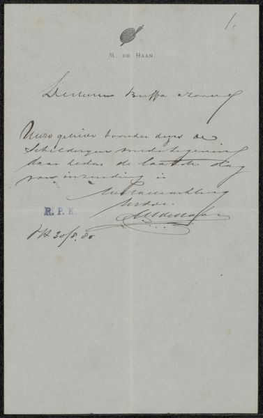
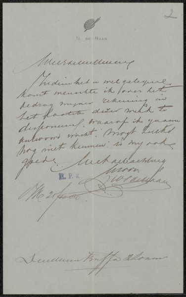
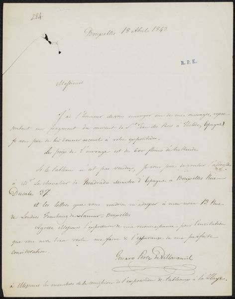
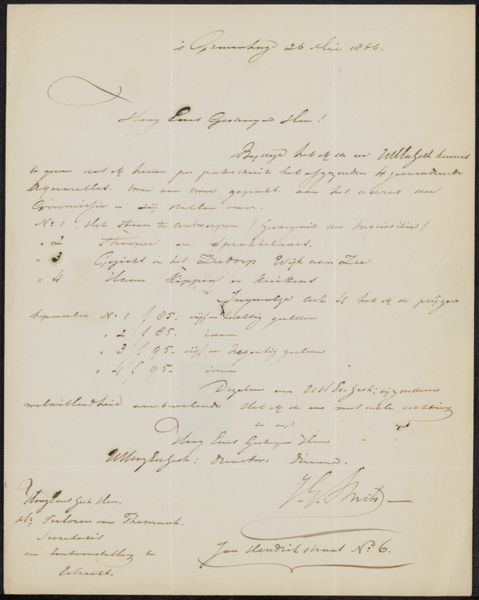
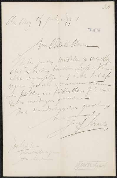
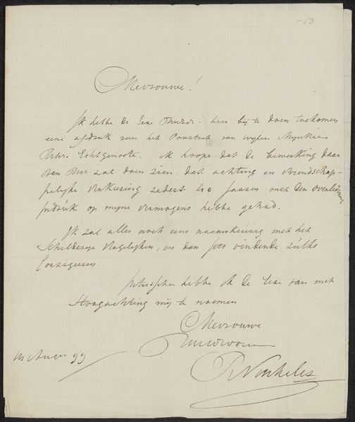
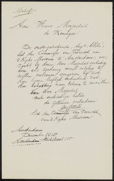
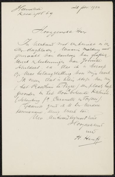
Curator: It has such intimacy. This “Brief aan Philip Zilcken,” a letter by Roger Jourdain, most likely created between 1910 and 1923, gives us a glimpse into a very particular moment in time. The ink on paper seems to capture a fleeting interaction. Editor: Yes, it feels so personal, doesn't it? It is like discovering a forgotten correspondence. The script itself feels… fragile, but also carries such authority of the era. There’s almost a performative elegance in the handwriting of officialdom. Curator: It really highlights the performative aspect of early 20th-century communication. Before email, such transactions relied so much on physical presentation. What symbols are communicated just through the handwriting style, beyond the actual words themselves? I am immediately drawn to that question. Editor: I wonder what those symbols truly represented. Who was Zilcken and what role did he play within the Orientalist art market that is mentioned at the bottom? We need to explore what the commercial art world meant in shaping cultural perceptions of the “Orient”. It tells me this image isn’t so much personal, but quite the opposite—representative of institutional mechanisms. Curator: Yes, “Service de Vente des Orientalistes…”—that definitely complicates the narrative of a simple, handwritten note. It opens up avenues into exploring colonial desires embedded in the art market of that time. Editor: And it brings up questions of authenticity. A hand-written note lends a certain sense of veracity—especially for something being bought or sold. The symbolic power of handwriting can also have a real impact on a consumer. It invites reflection on what details mattered for patrons in this period and the weight carried by particular visual symbols to signal the promise of “quality” or “exclusivity”. Curator: Absolutely. The hand-drawn typeface and "old engraving style" aesthetic that appears—combined with ink—hints at tradition while also engaging in commerce and distribution. Even just the contrast of the delicate script alongside what we now know represents a specific period and art market, makes you consider how visual symbols reflect deeper social structures. Editor: It all comes down to how power circulates through images and words, doesn't it? Considering these subtleties transforms a seemingly straightforward document into an archive ripe for critical inquiry. Curator: Precisely! Seeing something like this allows one to step back and look into all the intricacies surrounding its provenance with a clearer vision and appreciation. Editor: It also reminds us of how essential a physical artifact such as this is for grasping the political implications within everyday exchanges.
Comments
No comments
Be the first to comment and join the conversation on the ultimate creative platform.
More like this