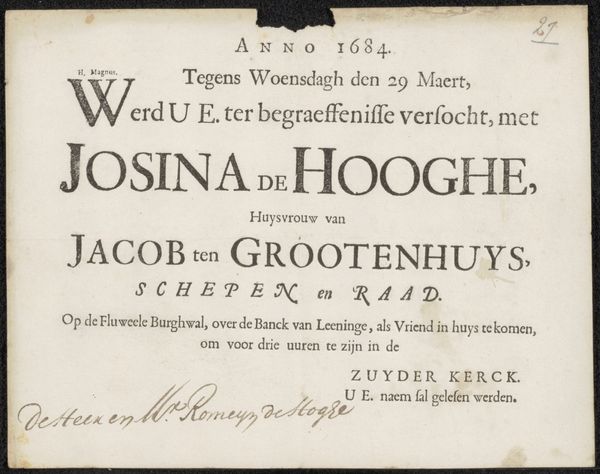
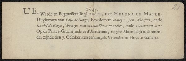
Uitnodiging aan Isaac van Erpecum voor de begrafenis van Nicasius de Hooghe before 1661
0:00
0:00
print, typography
# print
#
typography
#
calligraphy
Copyright: Rijks Museum: Open Domain
Editor: So, this is an invitation to Isaac van Erpecum for the funeral of Nicasius de Hooghe, before 1661, made with print and typography, and also uses calligraphy. It has an antique feel; it makes me feel as if I'm there in that historical time. What meaning do you find within the text and the artistry? Curator: Well, it's fascinating how something as utilitarian as an invitation can reveal so much. Look at the font choices and the layout – it speaks to the social hierarchies and the perceived importance of the deceased and the recipient. The calligraphy, particularly the signature, adds a personal, almost intimate touch, amidst the formality of the printed text. Editor: You mentioned social hierarchies. How would the imagery communicate that? I just see a printed page with text, but maybe there's more than meets the eye. Curator: Consider the weight of those names, "de Hooge," repeated and prominently displayed. Names held immense power, linking families to land, status, and lineage. And then the fact that this was printed, rather than handwritten for everyone, signals a certain level of importance afforded to those invited. Do you think that such use of the names of people serves as symbol of an ancient version of an influencer's club, which signals exclusivity? Editor: That makes a lot of sense, I had not considered the deeper connection behind printing. Thanks for clarifying that for me, I have learned how the selection of fonts and arrangement contribute significance beyond its obvious message. Curator: Indeed. The seemingly simple invitation encapsulates social, cultural, and even economic information encoded within its design, preserving memories and values across generations.
Comments
No comments
Be the first to comment and join the conversation on the ultimate creative platform.
More like this