print, typography
# print
#
typography
#
pop art
#
typography
#
pop-art
Copyright: Corita Kent,Fair Use
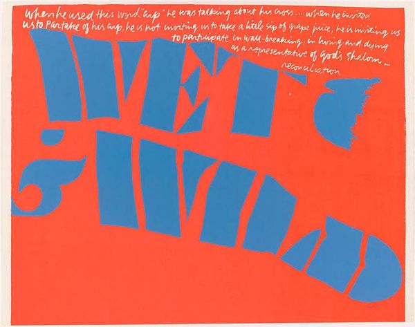
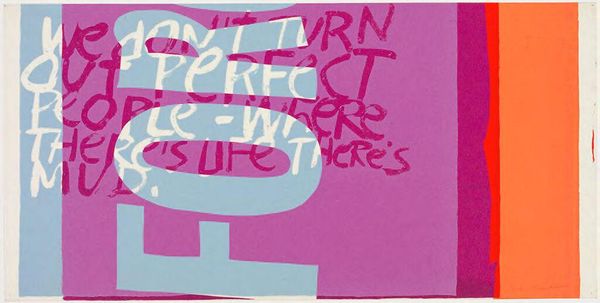
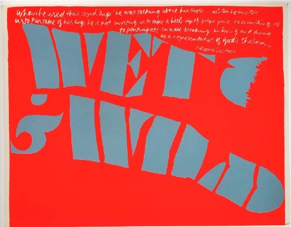
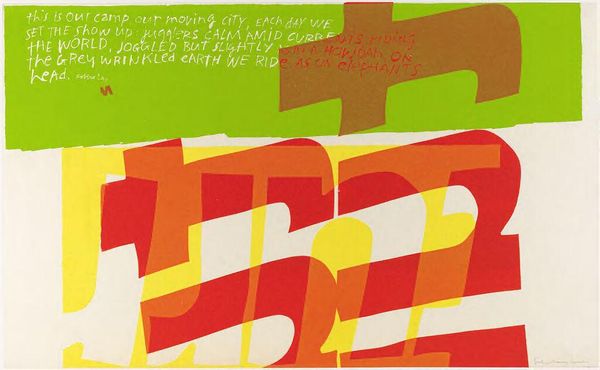
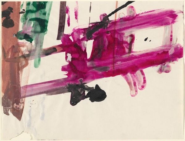
Corita Kent made this print "To All of My Calling Your Name" with screen printing, and you can just feel how much she loves colour. The pink is so saturated it vibrates off the paper and the white text is so bold it’s almost sculptural. I love the way she’s let the paint drip and bleed; it’s like the words are alive, pulsating with energy. Look at the way the ‘y’ in ‘your’ curls and dances. It's like she’s inviting you to join the party. Her work reminds me of Matisse, who used colour and collage to create these joyful, immersive worlds. Both artists share a sense of playfulness, and an understanding of the way that colour and form can communicate emotion. What do you feel when you look at this piece? For me, it’s joy, optimism, and a sense of connection.
Comments
No comments
Be the first to comment and join the conversation on the ultimate creative platform.
More like this