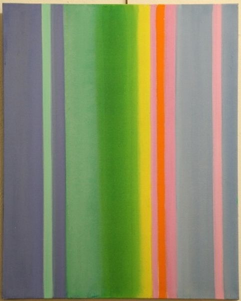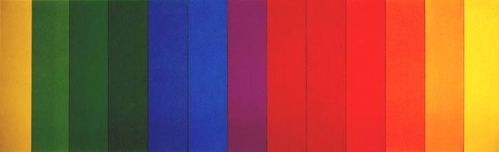
Curatorial notes
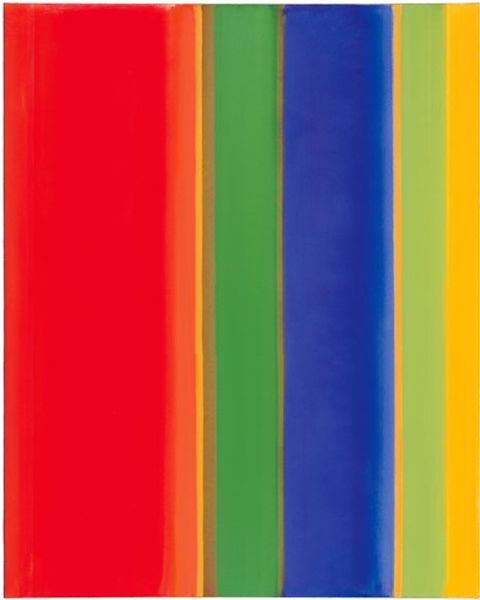
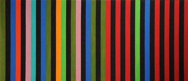
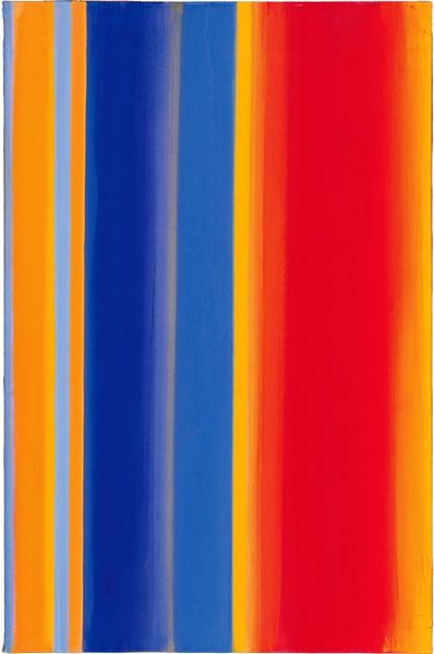
Curator: Here we have Ellsworth Kelly's "Spectrum III" from 1967, made using acrylic paint. Editor: I'm struck by its bold simplicity; just these flat vertical bands of color. How can something so minimal be so captivating? What's your take on this piece? Curator: From a materialist perspective, I'm interested in how Kelly elevates commercial acrylic paint to high art. It's not about representation, but about the direct experience of color, meticulously applied. Consider the labor involved in achieving such flatness, the sheer amount of paint required, and the industrial processes behind its production. What impact do you think this use of industrial materials has? Editor: I guess it challenges traditional ideas about artistic skill. It’s not about brushstrokes, but about this even application... almost like manufactured perfection? Does that connect with the Pop Art movement in any way? Curator: Exactly! The smooth, almost mechanical finish resonates with Pop Art’s embrace of mass production. But Kelly moves away from recognizable imagery, focusing instead on the pure sensory experience. How does that experience tie into our consumption habits of the era? The artwork doesn't hide that it’s made from commercial materials, instead showcasing a manufactured appearance. Editor: So it’s kind of a reflection on consumerism, but not in an obvious way, not through depicting product labels or anything. It’s more about highlighting the materials themselves and questioning their place in art. Curator: Precisely. By removing the artist’s hand, or at least obscuring it, Kelly draws attention to the paint itself – its texture, its reflective qualities, its very substance as a commodity. We see here a material’s transformation and how it generates meaning within the broader social fabric of production and consumption. Editor: That's fascinating. I hadn't thought about it that way. It’s not just a pretty picture; it’s a statement about art's relationship to industry and the materials that shape our world. Curator: Right, the material isn't just a means, but the very message. Considering it as a statement adds so many layers to unpack from such simple colors. Editor: I definitely see the painting in a different light now! It is not just an exercise of color but it opens a conversation of how art, industry and consumerism are intricately linked together.