drawing, ink
#
portrait
#
drawing
#
dutch-golden-age
#
figuration
#
ink
#
character sketch
#
genre-painting
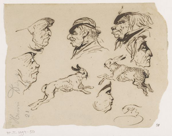
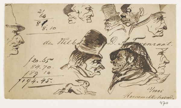
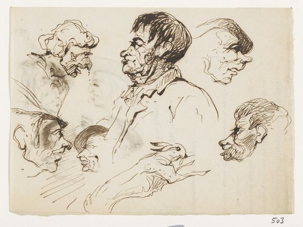
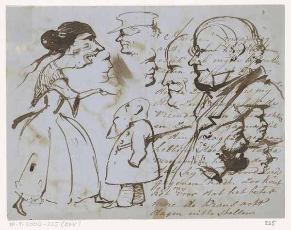
Dimensions: height 99 mm, width 160 mm
Copyright: Rijks Museum: Open Domain
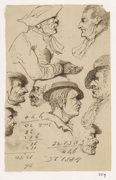
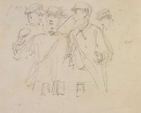
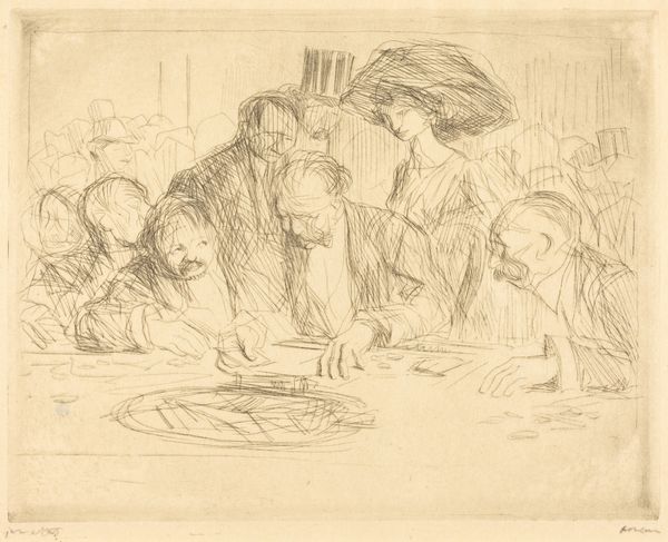
Editor: This is “Figuren te Zeist,” possibly from 1868-1869, by Johannes Tavenraat. It's an ink drawing, a quick study of several figures. There's a real sense of character in each of these faces; they seem very much like caricatures, exaggerated in their expressions. What stands out to you in this piece? Curator: What strikes me is how these figures, though rendered with swift, economical lines, resonate with familiar archetypes. Note the man with the raised chin – he embodies a certain pompousness, a self-regard we’ve seen echoed across centuries of portraiture. Do you think Tavenraat intentionally amplified these recognizable types? Editor: It certainly seems like it. It feels very deliberate. Curator: Indeed. Consider the man with the glass, almost like a stage prop. What might the inclusion of the glass signify? Perhaps fleeting pleasures, or something more precarious about the human condition? Tavenraat cleverly taps into well-worn visual cues that stimulate cultural memories. It's fascinating how simple ink strokes can summon such rich narratives. Editor: So, he's using these almost comical figures to tap into something deeper about humanity? Curator: Precisely! The seemingly lighthearted sketch unveils how deeply ingrained these character types are in our collective consciousness. This isn't just about documenting faces; it's about acknowledging the enduring power of symbolic representation. Editor: I didn’t initially see past the surface-level depiction of these characters, but understanding the layers of symbolism makes me appreciate how much can be conveyed with such a simple medium. Curator: And that, ultimately, is the enduring magic of visual imagery, isn’t it?
Comments
No comments
Be the first to comment and join the conversation on the ultimate creative platform.
More like this