Copyright: Ian Davenport,Fair Use
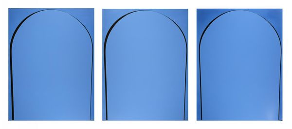
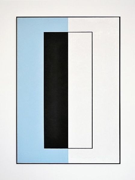
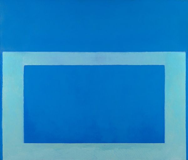
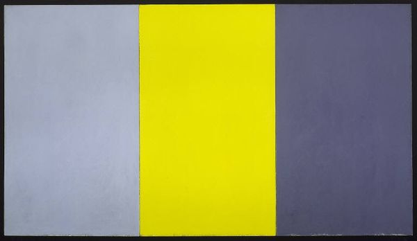
Curator: Standing here, looking at this work, "Poured Reversal Painting: Light Blue, Blue" created by Ian Davenport in 1999, I feel myself wanting to sigh deeply. Editor: That's interesting. I’m struck by the clarity, almost a feeling of being underwater, suspended in a world of tranquil blues. What prompts the sigh? Curator: Maybe it's the deceptive simplicity? On one level, it's just light blue and blue acrylic paint poured in lines, but the impact feels deeply meditative, almost like gazing at a very still sea. And it makes me question: Is that all there is? Or is that, paradoxically, everything? Editor: Absolutely. That clean, almost clinical line moving within its solid color field resonates deeply. The arch feels almost like a portal, wouldn't you agree? It brings to mind the visual language of arches in cathedrals, places of transition. Davenport seems to have distilled this essence into its purest form, prompting reflection. It uses a visual vocabulary for something intangible. Curator: That reading is fascinating! I hadn't thought of cathedrals. I was caught up in the physical act – the pour, the gravity at play. Knowing Davenport’s process, pouring these controlled lines becomes quite poetic; surrendering to gravity, allowing for these delicate visual rhymes and slight imperfections... Editor: It’s like the 'hand' is revealed precisely through the denial of gesture. In this controlled release there's an echo of those early modernist grids attempting to capture an almost spiritual purity in abstraction. But this work offers serenity in its minimalist dialogue between shape and solid color. What lingers with me is the implied motion held still—as a study of captured time in material form. Curator: Right, and that control speaks to the hard-edge painting tradition too. Everything here has to be perfect for it to work. But in that quest for perfection there’s the human vulnerability in how each thin pour responds so differently depending on the acrylic viscosity at that particular point in time... It reminds me to find beauty even within parameters and restrictions. It seems we might be creating more meaning here, the piece almost beckons it? Editor: I agree, it is a vessel for contemplation, that’s the brilliance of symbols, it is what is projected upon it that provides the viewer’s context for greater insight. And isn't that really where the magic lives in artwork?
Comments
No comments
Be the first to comment and join the conversation on the ultimate creative platform.
More like this