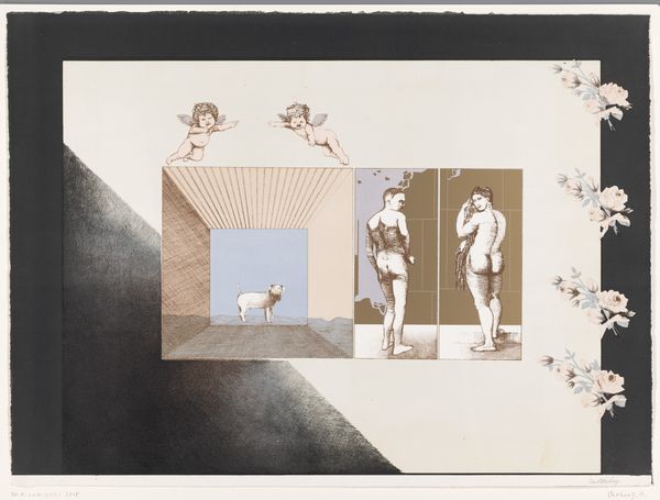
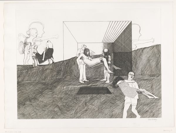
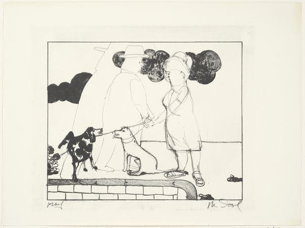
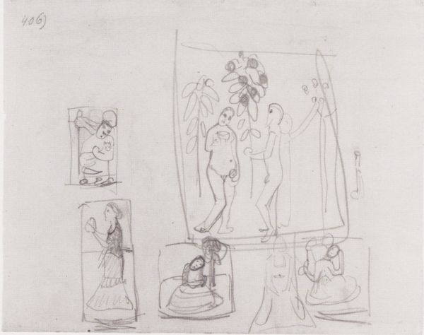
drawing, etching
drawing
etching
dog
etching
figuration
genre-painting
nude
realism
Dimensions: height 469 mm, width 640 mm, height 556 mm, width 754 mm
Copyright: Rijks Museum: Open Domain
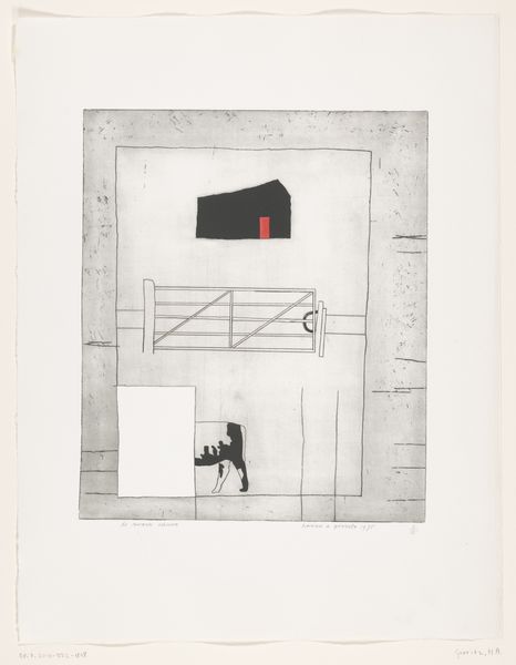
Editor: This is “Een leuke kleine hond (een Duitse droom)”, or "A nice little dog (a German dream)", a 1972 etching and drawing by Aat Verhoog, at the Rijksmuseum. It's quite the combination of images, isn't it? What do you see in how he arranged them? Curator: The organization into discrete, geometric panels arrests the eye. Note the tension established by juxtaposing seemingly unrelated forms: cherubic figures against severe right angles, textured haziness with the precise lines of the dog’s enclosure, the classical nudes held in comparison to that stylized landscape. What principles of organization might govern these formal contrasts? Editor: Well, the crisp lines definitely define the dog and the room it's in, and also create very defined figures to the right. While above and to the side of those crisp, controlled sections are hazy smudges that don't define distinct forms. But what does it all mean? Is it purely contrast for its own sake? Curator: Semiotically, these visual contrasts are vital. Consider the use of line, its variations in weight and density, how it delineates form and space. What does the medium of etching, with its inherent graphic quality, lend to our understanding of Verhoog’s vision? Does the formal composition serve to frame and order a chaotic world? Editor: It is interesting that you mention framing... the box in a box, along with the vertical rectangular divisions of the bodies, makes me think about voyeurism, and how each section creates its own world and confines each element. But what is being said with these elements? Are the classical forms and figures like the nudes a form of German "high art" or thought, in opposition to something more "common," like the dog in the box? Curator: Precisely! The graphic idiom of the etching gives structure to the comparison itself. Do you observe that by contrasting planes of reality, Aat Verhoog compels you to examine the components and organization of what is presented, or perhaps something of how it is being presented? The relationship between surface and depth, order and disorder? Editor: I see the way the forms interact creates this conversation, pulling you in. Looking at this etching from this perspective gave me some new insights. Curator: Indeed. The image embodies tensions born of binaries and their structured comparison and arrangement on the page, challenging us to resolve the dialectic in a new synthesis.
Comments
No comments
Be the first to comment and join the conversation on the ultimate creative platform.
More like this