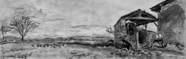
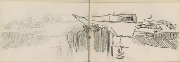
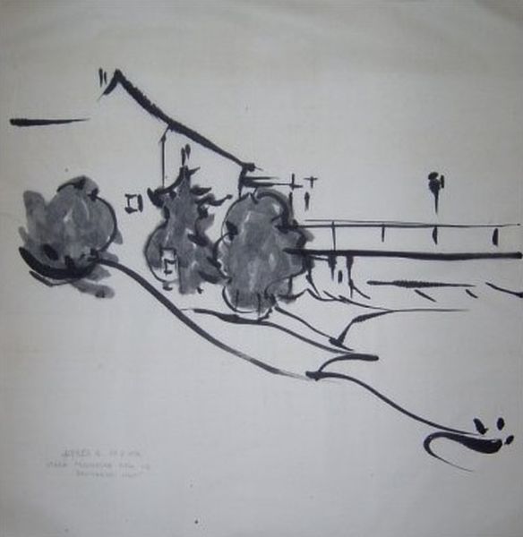
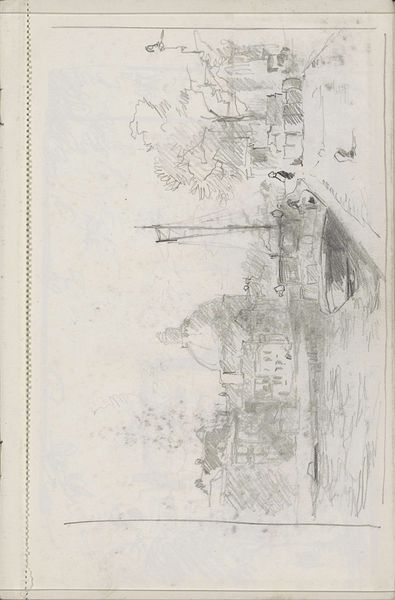
Venstre side: løse rids af et hus, samt tre kvinder, der arbejder i marken. Højre side: udsigt henover "Hotel de Savoi", mod La Batille, Grenoble 1885
0:00
0:00
drawing, plein-air, charcoal
#
drawing
#
amateur sketch
#
rough brush stroke
#
impressionism
#
plein-air
#
incomplete sketchy
#
landscape
#
charcoal drawing
#
charcoal art
#
brush stroke
#
free hand
#
freehand
#
rough sketch
#
expressive brush stroke
#
charcoal
Dimensions: 120 mm (height) x 337 mm (width) (bladmaal)
Curator: Looking at this charcoal drawing by Johan Barthold Jongkind, created around 1885, titled "Venstre side: løse rids af et hus, samt tre kvinder, der arbejder i marken. Højre side: udsigt henover "Hotel de Savoi", mod La Batille, Grenoble," the immediacy really strikes me. There's a clear division, almost a diptych effect. Editor: Absolutely, my immediate response is to the stark contrast, isn't it? The left is so skeletal, almost ephemeral, versus the weight of the "Hotel de Savoi" scene on the right. It's not just visual weight either; there's an implied socioeconomic one too. Curator: Precisely. Consider the working women depicted on the left, figures rendered in the barest lines. It echoes the labor of women—often unseen, almost erased— juxtaposed with a leisure destination, signified by the hotel. Jongkind is presenting these separate social spheres coexisting, and it encourages a critique on class disparity. Editor: And the choice of charcoal as the medium reinforces that contrast. The rough, almost violent strokes used to depict the hotel speak to a different kind of energy than the faint strokes showing the laborers in the fields. We tend to overlook the cultural meanings ingrained in medium selection itself, and how that intersects with socioeconomic depictions. Curator: I agree. Jongkind’s technique—the quick plein-air sketches—contributes to this feeling of witnessing a fleeting moment. Yet, the act of sketching those women, even fleetingly, provides visibility— acknowledging them even if they are barely depicted. This speaks to how we frame labor through art. Are they there just as landscape adornment or figures possessing historical presence? Editor: What about the visual language inherent in depicting a hotel like that? It almost becomes an emblem of leisure, a visual shorthand. Jongkind employs common signs associated with privilege while seemingly erasing labor with more vague lines and form. Do you think there's any intention in framing that hotel’s name so boldly? It commands attention amidst an artwork where meaning is built on absence. Curator: I think you hit on something essential. That very prominence forces the viewer to confront what's given prominence versus what's deliberately diminished or abstracted. Perhaps it encourages questioning, forcing us to recognize that representations aren't passive but rather shaped by conscious and often, subconscious social biases. Editor: Ultimately, the tension of these opposing images invites inquiry into systems of privilege and erasure— how power dictates the artistic representation and social visibility of certain populations above others. Curator: Precisely. By looking at the context and social dynamics within even a seemingly simple landscape drawing like this, we unearth so much about art's role in mirroring and shaping social perspectives.
Comments
No comments
Be the first to comment and join the conversation on the ultimate creative platform.
More like this