print, photography, architecture
#
script typeface
#
aged paper
#
medieval
#
script typography
# print
#
sketch book
#
hand drawn type
#
landscape
#
photography
#
romanesque
#
personal sketchbook
#
hand-drawn typeface
#
thick font
#
handwritten font
#
architecture
#
historical font
Dimensions: height 145 mm, width 194 mm
Copyright: Rijks Museum: Open Domain
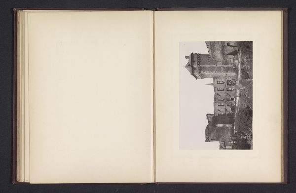
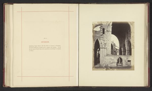
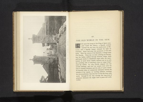
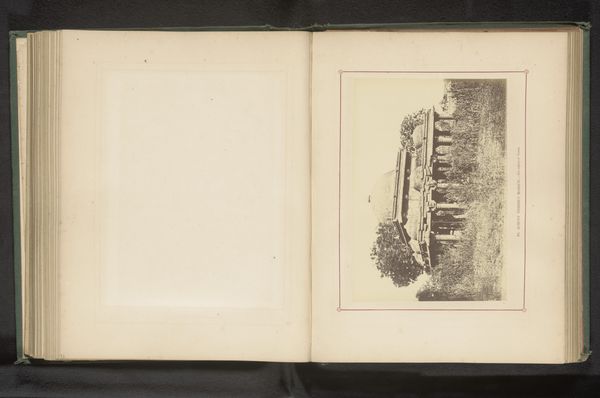
Editor: Here we have "Gezicht op de ruïne van Haughmond Abbey," dating from before 1877, attributed to J. Laing. It seems to be a page from a book, juxtaposing a photograph of the Abbey ruins with ornate text. It strikes me as quite poignant – a record of decay but also a celebration of history. What do you see in this piece, from your perspective? Curator: Well, first, I think it’s interesting to see photography used in this way within a bound volume. The late 19th century was a time when photography was still negotiating its place within visual culture, especially concerning the picturesque and historical record. Consider how the act of capturing this ruin serves a cultural purpose. Is it simply documentation, or is it imbued with a sense of romantic nationalism? What was the perceived role of these monastic ruins in the cultural imagination of the time? Editor: That's a good point; it feels almost like an elegy. So, are you suggesting this image participates in constructing a particular historical narrative? Curator: Precisely! And note the typeface accompanying the image. The almost gothic lettering lends a certain gravitas and authenticity, attempting to visually transport the viewer back to the medieval period. Who was the intended audience here? Were they local historians, antiquarians, or perhaps those with a vested interest in the Abbey's legacy? This volume serves not just as a historical document but as an ideological statement about the past and its place in the present. Editor: The connection between the typography and the photograph makes so much more sense now. It really shows how art can shape how we view the past! Curator: Absolutely. The strategic framing and visual language speak volumes about the era's fascination with, and active construction of, its historical roots. It has given me cause to reconsider how such relics contribute to shaping national identity.
Comments
No comments
Be the first to comment and join the conversation on the ultimate creative platform.
More like this