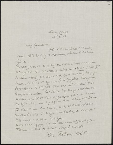
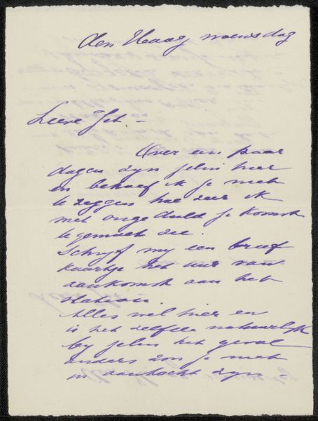
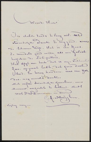
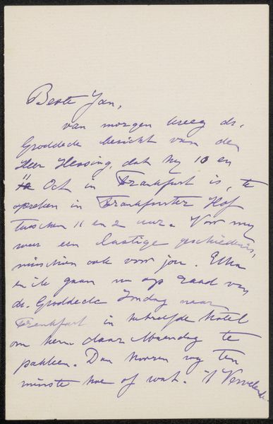
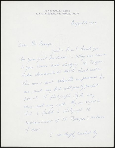
drawing, paper, ink
#
portrait
#
drawing
#
type repetition
#
contemporary
#
hand written
#
script typography
#
hand-lettering
#
old engraving style
#
hand drawn type
#
hand lettering
#
paper
#
personal sketchbook
#
ink
#
hand-written
#
hand-drawn typeface
#
calligraphy
Copyright: Rijks Museum: Open Domain
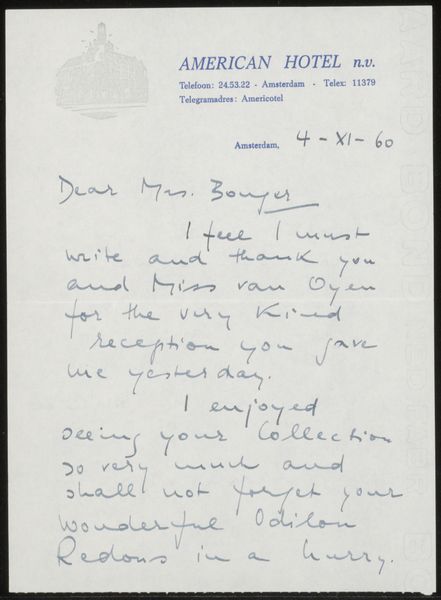
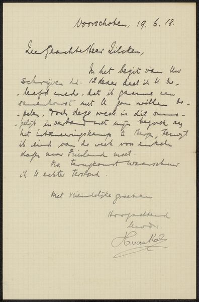
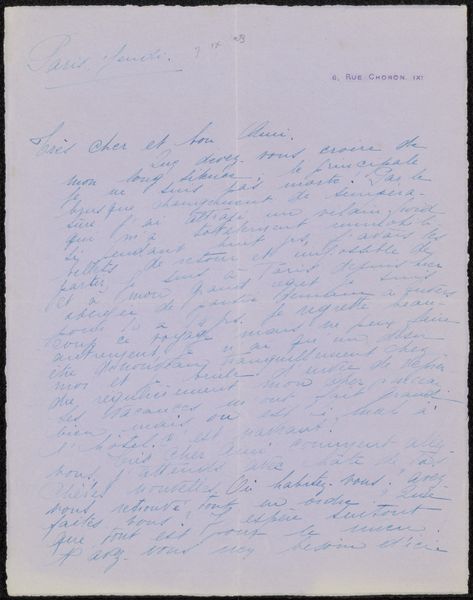
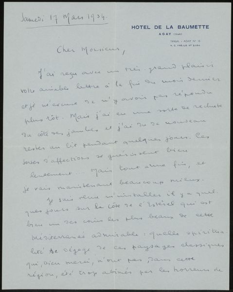
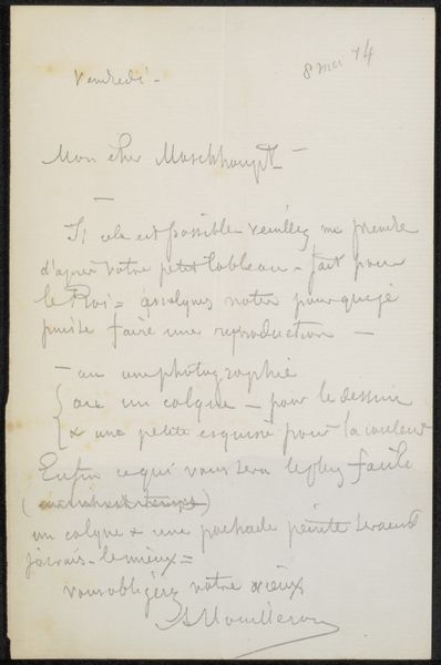
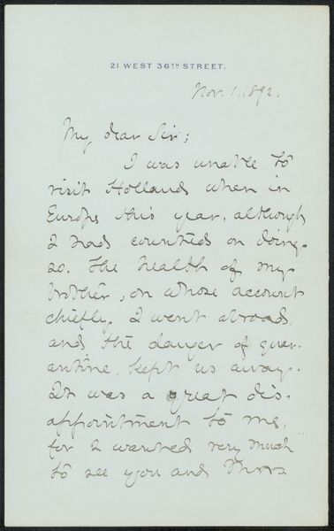
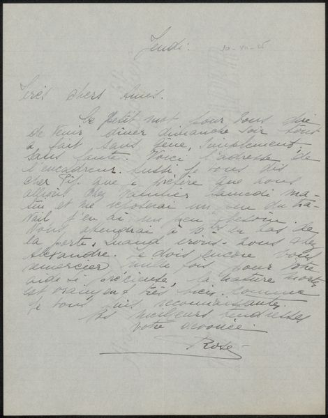
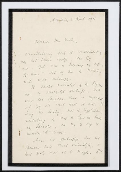
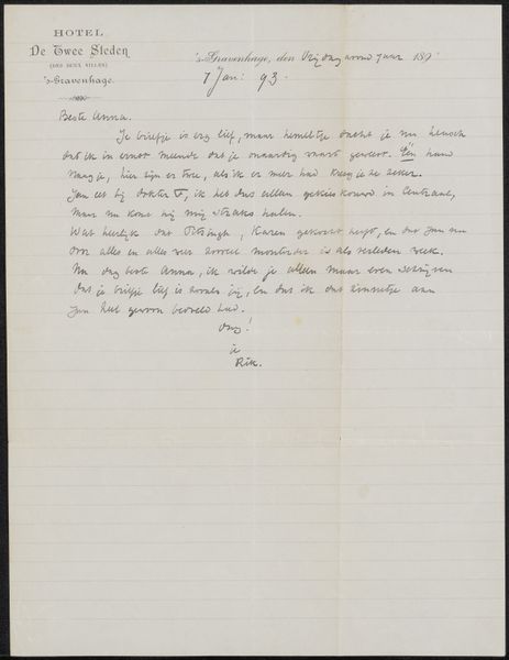
Editor: Here we have "Brief aan Françoise W.M. Bonger," a letter created by G. Jolten before 1975, composed of ink on paper. It’s got a casual, yet intimate feel, due to the hand-written aspect of it, though at the same time I get this strange formal tone. What strikes you about this letter? Curator: The material conditions of this letter speak volumes. Look at the paper itself. It’s letterhead from the Amstel Hotel in Amsterdam. This tells us about the social and economic position of the author. A stay at such a place signals privilege, access to a certain level of material comfort and luxury. How might that perspective affect our understanding of the text's meaning? Editor: So the location of the letter's origin influences how we interpret the message and intent? It's like considering the socio-economic background of a patron commissioning a painting? Curator: Precisely! And consider the labour involved. The handwritten script implies a personal touch, yet the form of a letter is tied to systems of communication, trade, and even bureaucracy. Are these words carrying personal meaning or is the materiality conveying another level of cultural identity, class, or belonging? Editor: That's so interesting. I wouldn't have thought about it like that! It seems like analysing the raw materials gives so much cultural context that would’ve gone unnoticed before. Curator: Indeed. By focusing on the tangible aspects, we uncover layers of meaning beyond the literal words on the page. The materiality transforms the personal into the political and socio-economic narrative of a specific time and class.
Comments
No comments
Be the first to comment and join the conversation on the ultimate creative platform.
More like this