drawing, paper, ink, pen
#
drawing
#
hand-lettering
#
old engraving style
#
hand drawn type
#
hand lettering
#
paper
#
personal sketchbook
#
ink
#
hand-drawn typeface
#
intimism
#
pen-ink sketch
#
pen work
#
sketchbook drawing
#
pen
#
sketchbook art
#
calligraphy
Copyright: Rijks Museum: Open Domain
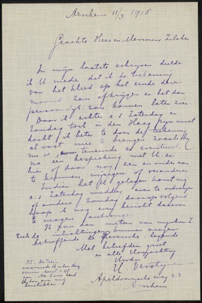
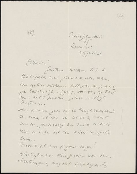
Hendrikus Hubertus van Kol created this letter to Philip Zilcken in 1918. Immediately, the eye is drawn to the contrast between the rigid grid of the paper and the fluid, cursive script that fills the space. The handwriting, with its varying pressure and rhythm, creates a unique texture. Van Kol's choice of a grid as the underlying structure introduces a fascinating tension. The grid, a symbol of order and rationality, is overlaid with the organic, expressive qualities of handwriting. It represents how personal expression interacts with the broader framework, where individual voices navigate and negotiate within prescribed structures. This interplay challenges the notion of fixed meanings and highlights the inherent fluidity of communication. The act of writing, a deliberate imposition of form, becomes an exercise in navigating and subverting established patterns. We are left to consider how even within rigid systems, the individual's mark can assert itself.
Comments
No comments
Be the first to comment and join the conversation on the ultimate creative platform.
More like this