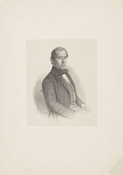
drawing, pencil
portrait
pencil drawn
drawing
pencil sketch
old engraving style
pencil drawing
romanticism
pencil
academic-art
realism
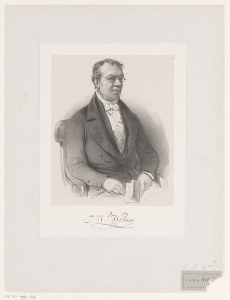
Dimensions: height 354 mm, width 260 mm
Copyright: Rijks Museum: Open Domain
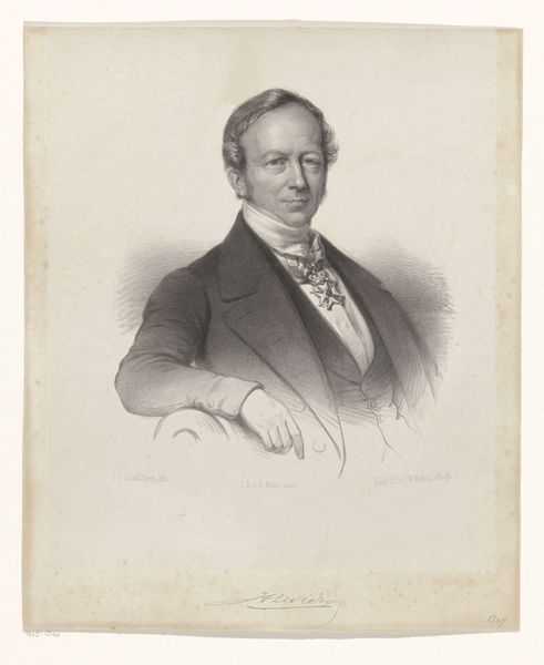
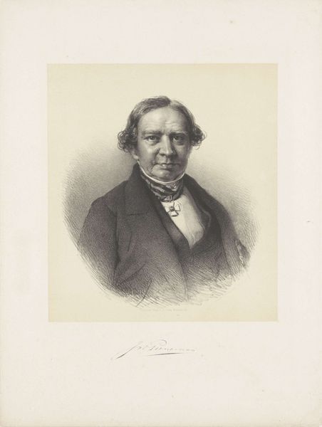
Editor: Here we have J.B. Clermans' 1835 pencil drawing, "Portret van Johann Wilhelm Wilms". It feels like such an intimate glimpse into the past. What catches your eye in this work? Curator: The most striking aspect is undoubtedly the artist's masterful handling of line. Observe the variation in pressure, creating a subtle interplay of light and shadow that models the subject's features with remarkable precision. Notice also the textural contrast between the sharply defined facial details and the more loosely rendered clothing. How do you think this contrast affects the overall composition? Editor: I guess it keeps your focus on Wilms' face, since that has so much detail. Curator: Precisely. Furthermore, consider the deliberate asymmetry of the composition. The subject is slightly offset, creating a dynamic tension within the frame. One might even consider the signature not merely as identification but as an integral compositional element, grounding the figure. The way the values shift is masterful for a single tone work. Editor: I hadn’t considered the signature like that. It really balances the portrait, almost like a visual anchor. Does the subject's clothing say anything about his role in society, or about how Clermans viewed him? Curator: Perhaps. However, let us primarily consider what the artist is *showing* us. The emphasis is on the face. We might discuss attire but ultimately those elements remain subservient to the overall artistic treatment. We can't assume intent without supporting visual evidence. Editor: That makes a lot of sense. I definitely appreciate how much I can learn just by focusing on what's visible in the work. Curator: Indeed. Through a close examination of its formal elements, we gain a deeper understanding of the artist's skill and intention. Editor: I see this drawing with new eyes! Curator: And hopefully, new questions.
Comments
No comments
Be the first to comment and join the conversation on the ultimate creative platform.