Copyright: National Gallery of Art: CC0 1.0
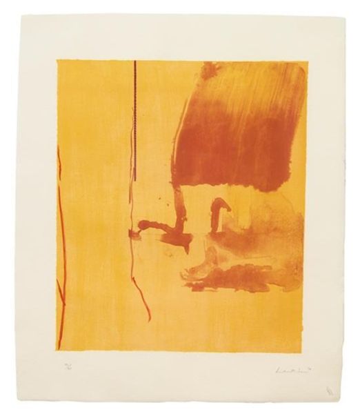
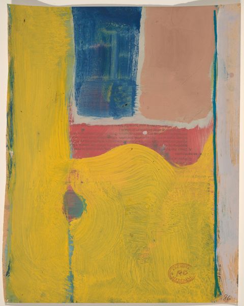
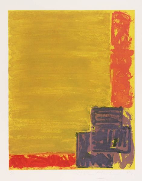
Jacob Kainen made this print, Starbuck I, in 1972, and it's a trip, right? It’s got this sunny, almost childlike vibe, but with a sophisticated edge. The way he lays down the colors, it's like he's letting the process be visible, showing the mechanics of artmaking. Look at that bright, almost glaring yellow. It feels like a warm summer day, a bit overwhelming, intentionally so. The floating red form, it's hard to pin down, like some kind of ambiguous vessel that is almost like a figure. Kainen isn't trying to hide the layers, you can see the ghost of the blue underneath the red, the textures colliding. There is this sun shape with the expressive brushstrokes all around it, making it feel alive and buzzing. It reminds me a bit of Joan Miró, or maybe even some of the early abstract expressionists, that sense of freedom, but with a tighter, more graphic feel. It's a reminder that art is always talking to itself, echoing and remixing ideas across time. It's not about answers, it’s about seeing and feeling in new ways.
Comments
No comments
Be the first to comment and join the conversation on the ultimate creative platform.
More like this