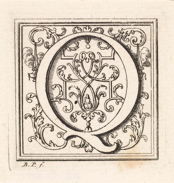
print, typography, engraving
#
baroque
# print
#
old engraving style
#
typography
#
geometric
#
engraving
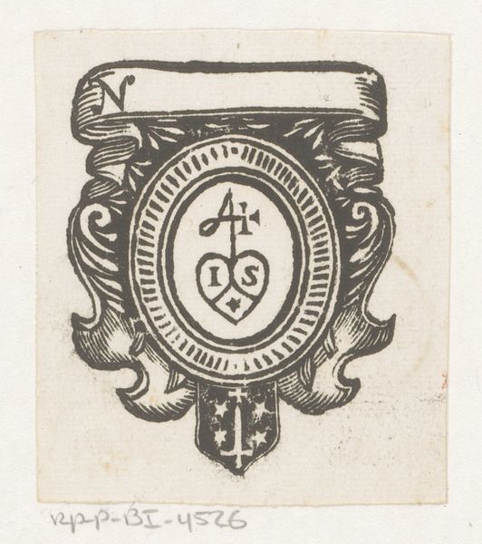
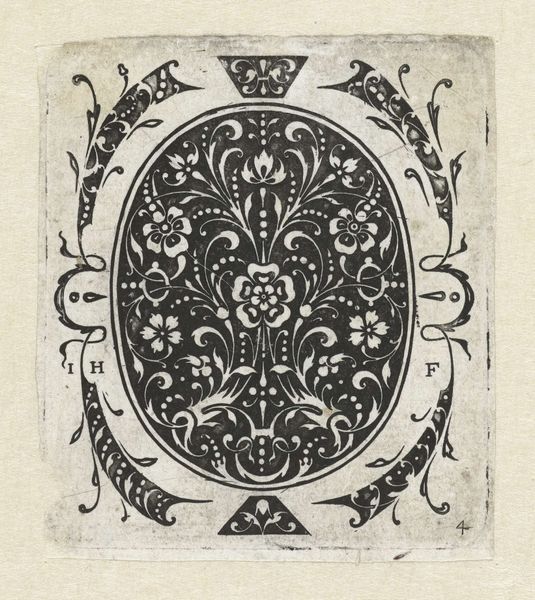
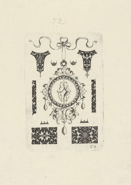
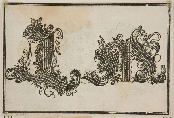
Dimensions: height 70 mm, width 64 mm
Copyright: Rijks Museum: Open Domain
Editor: This is a rectangular pendant from 1619 by Jacques Hurtu at the Rijksmuseum, a print featuring typography and engraving. It feels almost like a little puzzle box. The alphabet is neatly presented, but all these decorative swirls feel like they could hold another message. What do you see in this piece? Curator: Well, on the surface, it appears to be a simple display of the alphabet. But let's consider the social and historical context. It comes from a time when literacy was deeply connected to power and religious interpretation. Notice how the alphabet is framed by ornamental flourishes. Do you think those elements might be working to elevate the written word? Editor: It could be about emphasizing literacy. But it's also a pendant, meant to be worn. Was literacy becoming a sort of status symbol? Curator: Precisely! And status is inherently tied to identity. Who had access to education? Who was excluded? Think about the rise of the merchant class in the 17th century, the changing social landscape. A piece like this reflects a shift in who could participate in literate culture. Moreover, it may even hint at one’s religion or creed through symbols or the choice of letterforms, thus communicating something non-explicit. Editor: So it's more than just a pretty alphabet. It's about who gets to use the alphabet and what that says about their position in society. I never thought about it like that. Curator: Exactly. And isn’t that fascinating? We often view typography as neutral or purely functional, but this piece reminds us that even the ABCs can be loaded with social and political meaning. Editor: That makes you wonder about the future and what kinds of things that will show through in typography going forward. Thanks for clarifying that, I hadn't quite pieced all of that together!
Comments
No comments
Be the first to comment and join the conversation on the ultimate creative platform.
More like this