print, typography, architecture
# print
#
11_renaissance
#
typography
#
architecture
Dimensions: height 388 mm, width 261 mm
Copyright: Rijks Museum: Open Domain
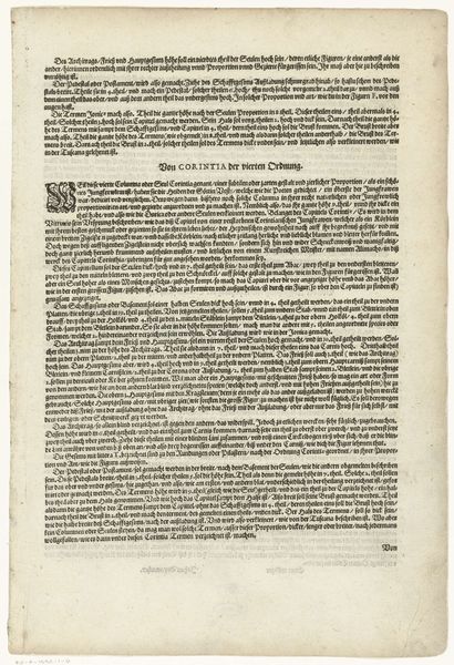
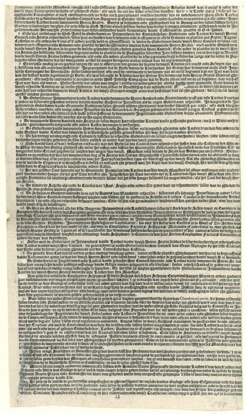
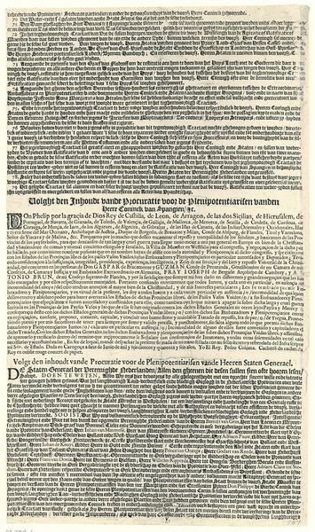
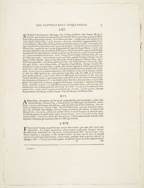
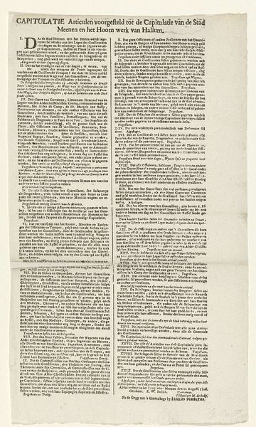
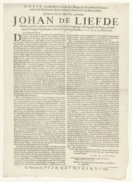
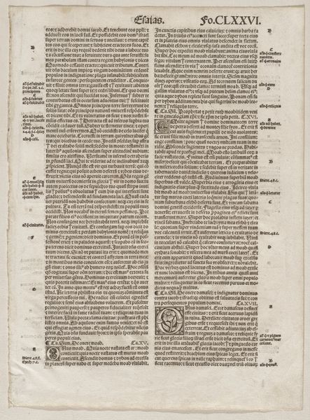
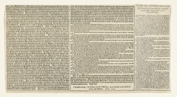
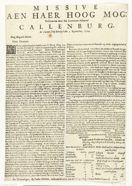
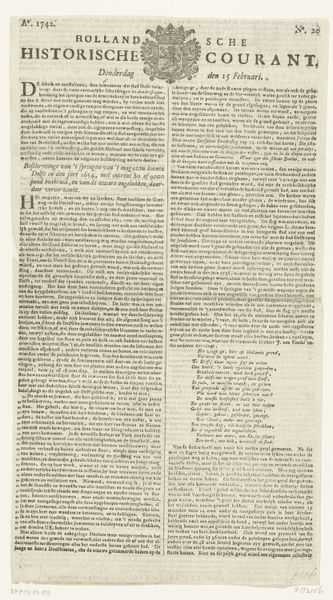
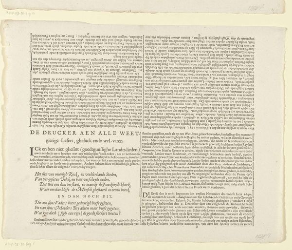
Curator: Oh, this is a page from Gabriel Kramer’s “Architectura von den funf Seuvlen…", printed in 1610. It’s a fascinating example of architectural typography. Editor: It’s... a wall of text! In German, no less. My immediate impression is one of intense focus. Imagine spending hours deciphering this in the dim light of the 17th century. A world far from our instant access to information! Curator: Precisely! These prints served as guides for builders and craftsmen. Notice how the text is densely packed, yet clearly organized? Kramer is essentially translating classical architectural principles into a readable format for a burgeoning readership. Editor: You're right, there's a certain elegance to the layout, despite the overwhelming impression. The intricate lettering has an aesthetic quality all its own, especially the capitalized headings and the ornamental flourish beneath "Den DORICA der ander Ording". That has its own distinct architectural feel, like some strange Doric-letter hybrid. Curator: Doric columns represent strength and simplicity, the perfect symbol, I guess. It reflects the growing interest in classical architecture during the Renaissance and how printed books played a vital role in spreading these ideas beyond elite circles. They are making this information accessible to wider community. Editor: Thinking about the social impact – this kind of document facilitated a massive shift. It wasn't just about aesthetic revivals, it was empowering a new class of builders, shifting power away from traditionally trained architects tied to wealthy patrons. It embodies a democratizing force. Curator: Absolutely. It speaks volumes about the changing role of information and the growing importance of technical knowledge in society. And of course, the cultural value placed on those classic shapes is revealed in the writing! Editor: Well, considering this intense text wall...I am all the more appreciative of blueprints today, but to me the intense amount of details and classical references provide so much to admire. It has opened another avenue of how craftsmanship changed in response to new social changes.
Comments
No comments
Be the first to comment and join the conversation on the ultimate creative platform.
