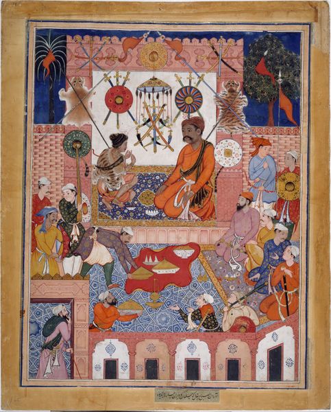
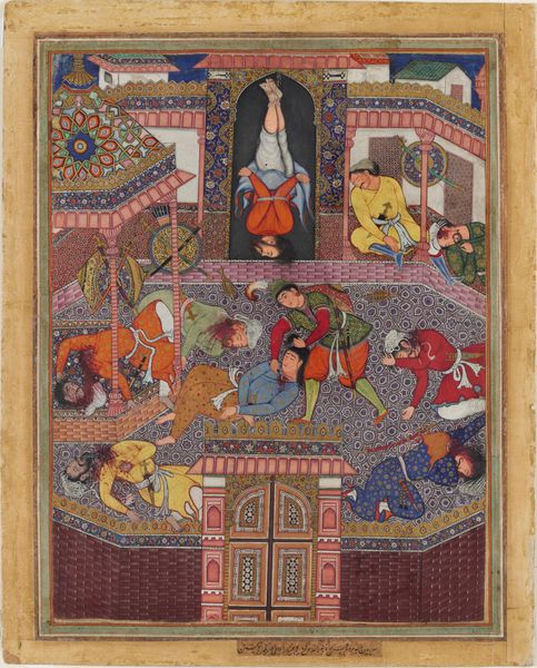
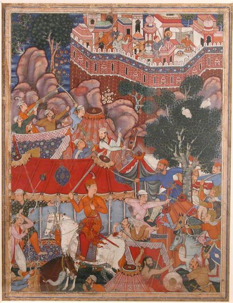
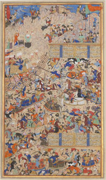
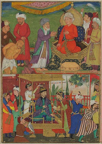
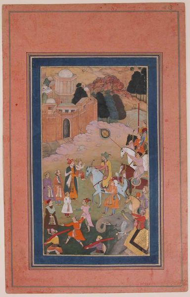
"Hamza's Heroes Fight in Support of Qasim and Badi'uzzaman", Folio from a Hamzanama (The Adventures of Hamza) 1539 - 1594
0:00
0:00
tempera, painting, paper, ink
#
water colours
#
narrative-art
#
tempera
#
painting
#
figuration
#
paper
#
ink
#
painting art
#
islamic-art
#
history-painting
#
miniature
Dimensions: H. 27 in. (68.6 cm) W. 21 1/4 in. (54 cm)
Copyright: Public Domain
Editor: Here we have "Hamza's Heroes Fight in Support of Qasim and Badi'uzzaman," a folio from a Hamzanama, made between 1539 and 1594 using ink, tempera, and watercolors on paper. It is currently housed at the Metropolitan Museum of Art. The sheer detail and vibrant color are overwhelming; how would you interpret this piece? Curator: The initial impression is indeed of vibrant energy. Focus first on the structural elements: observe how the artist employs a flattened perspective, eschewing traditional depth cues for a dense, interwoven composition. Notice how the spatial recession is suggested through overlapping forms and a shift in scale, not linear perspective. Editor: Yes, the lack of traditional perspective is striking. What’s the effect of this flattening? Curator: It brings the foreground and background into the same visual plane. See how the ornate architectural details create a tapestry-like effect that counterpoints the figures’ dynamic movements. The colors also function structurally. The artist’s juxtapositions of saturated hues, such as the reds and greens, amplify the sense of activity and visual complexity, no? Editor: I see it. And there are repeating geometric patterns everywhere—the tiles, the textiles…it is almost dizzying. Curator: Precisely! Consider how the repetition of patterns interacts with the figuration, blurring the distinction between the narrative action and its decorative framework. This creates a tension between representation and abstraction, and we may then consider the aesthetic intention. What statement do you think this artist tries to make? Editor: The emphasis on visual patterns over realistic perspective feels deliberate, a decision about form itself to emphasize color, composition and technique above all else. Curator: Indeed! By analyzing its formal qualities we begin to grasp the artist's vision. Editor: This gives me a new perspective, to look past the literal figures in the story and look more closely at how they work together as part of an overall design!
Comments
No comments
Be the first to comment and join the conversation on the ultimate creative platform.
More like this