graphic-art, print, typography, engraving
#
graphic-art
#
aged paper
#
script typography
#
hand-lettering
#
dutch-golden-age
# print
#
hand drawn type
#
hand lettering
#
typography
#
fading type
#
stylized text
#
thick font
#
handwritten font
#
engraving
#
small lettering
Dimensions: height 140 mm, width 190 mm
Copyright: Rijks Museum: Open Domain
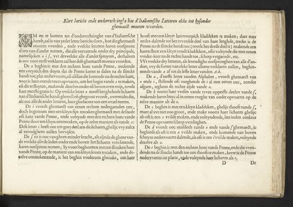
Editor: This is "Waarschuwing, pagina 2," or "Warning, page 2," made in 1641 by Crispijn van de Passe the Younger. It’s currently housed in the Rijksmuseum. Looking at this aged page filled with tightly packed text, I'm immediately struck by its weight. It feels so…authoritative. What do you see in this piece? Curator: Authority is a curious word for it. This isn’t just text; it's an *utterance*, a proclamation! I imagine van de Passe hunched over a copper plate, carving these warnings with painstaking precision. Each letter is deliberate, practically screaming for attention across the centuries. Think of it, this was the age of powerful sermons and stern moral pronouncements. Does it make you think of any similar images or experiences you've seen or had? Editor: Now that you mention it, yes. The overall effect reminds me a bit of some of the fire-and-brimstone sermons I had to listen to as a kid. It’s the same feeling of being confronted with undeniable, though maybe questionable, truths. Do you think people in the 17th century felt similarly? Curator: Oh, undoubtedly! The Dutch Golden Age wasn't *all* tulips and jovial tavern scenes. There was a real undercurrent of moral anxiety, fueled by religious fervor and the rapidly changing world around them. Van de Passe is tapping into that, weaponizing typography to deliver a stern wake-up call, warning about moral and social misconduct! I suspect such “truths” are still kicking around today. What would your interpretation of this 17th century 'warning' be? Editor: Seeing it this way really shifts my understanding. It’s more than just historical typography. It’s a reflection of a society grappling with its own conscience, immortalized in ink! It makes me think about all of the historical context behind the work and how it relates to current-day culture and artistic values. Curator: Exactly. What looks austere to us might have felt incendiary back then, a mirror reflecting the turbulent emotions of a new era.
Comments
No comments
Be the first to comment and join the conversation on the ultimate creative platform.
More like this