drawing, paper, ink
#
portrait
#
drawing
#
imaginative character sketch
#
toned paper
#
light pencil work
#
quirky sketch
#
dutch-golden-age
#
pencil sketch
#
paper
#
personal sketchbook
#
ink
#
pen-ink sketch
#
sketchbook drawing
#
watercolour illustration
#
genre-painting
#
sketchbook art
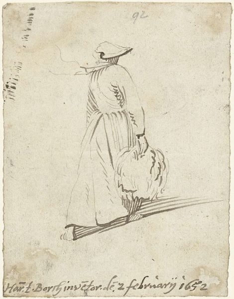
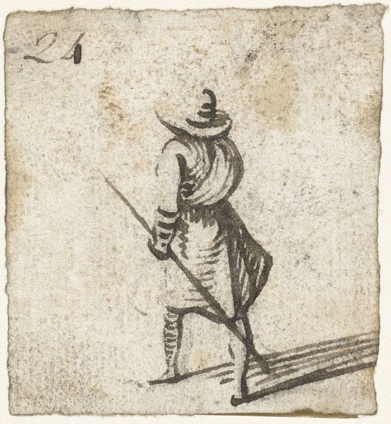
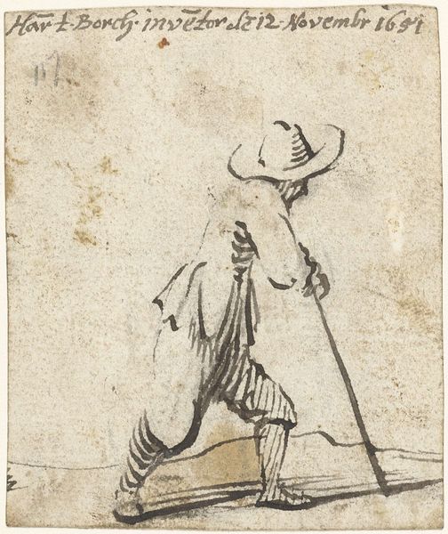
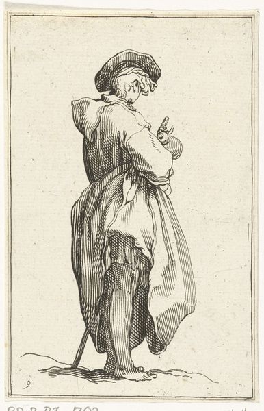
Dimensions: height 97 mm, width 80 mm
Copyright: Rijks Museum: Open Domain
Editor: So, this is "Boy with a wide-brimmed hat and a jug, from the back," possibly from 1651, by Harmen ter Borch. It's a drawing with pen, ink, and watercolor on paper. I find the sketchiness very charming, like a quick glimpse into a 17th-century everyday scene. What jumps out at you? Curator: Primarily, I observe the masterful economy of line. Ter Borch evokes form and texture with incredible efficiency. Notice how the varying pressure of the pen creates depth, particularly in the folds of the clothing and the curve of the jug. The artist contrasts the closely placed line of the shadow, creating the mass, with those spaced farther apart for light. What does that visual cadence create? Editor: A kind of rhythmic movement across the figure, I suppose? Emphasizing its presence in space despite the lack of a detailed background. It almost feels like he's stepping out of the page. Curator: Precisely. And consider the intentional use of blank space. Ter Borch isn’t trying to create a photorealistic depiction. The negative space around the figure serves to isolate and emphasize its form, directing our gaze to the central subject, thus solidifying the thematic concern: an unassuming depiction of everyday life, which provides the core tension. Editor: I hadn’t thought about the emptiness contributing so much! So it's not just a sketch; it’s a carefully considered arrangement of lines and space? Curator: Absolutely. Every mark, or lack thereof, serves a purpose. Consider how the use of watercolor enhances the tonal range of the piece as a whole. The image works within a defined but strict semiotic construct. It seems that his hand controlled the tonality very intentionally. Editor: It's amazing how much intention can be packed into what seems like a simple sketch. Thanks for helping me see beyond the initial impression! Curator: My pleasure! Remember, form dictates content, not merely represents it.
Comments
No comments
Be the first to comment and join the conversation on the ultimate creative platform.
More like this