graphic-art, print
#
graphic-art
#
water colours
#
muted colour palette
# print
#
colour-field-painting
#
geometric
#
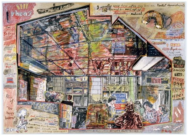
cityscape
#
watercolour illustration
Dimensions: Image: 279 x 355 mm Sheet: 333 x 435 mm
Copyright: National Gallery of Art: CC0 1.0
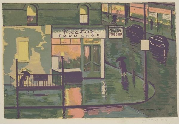
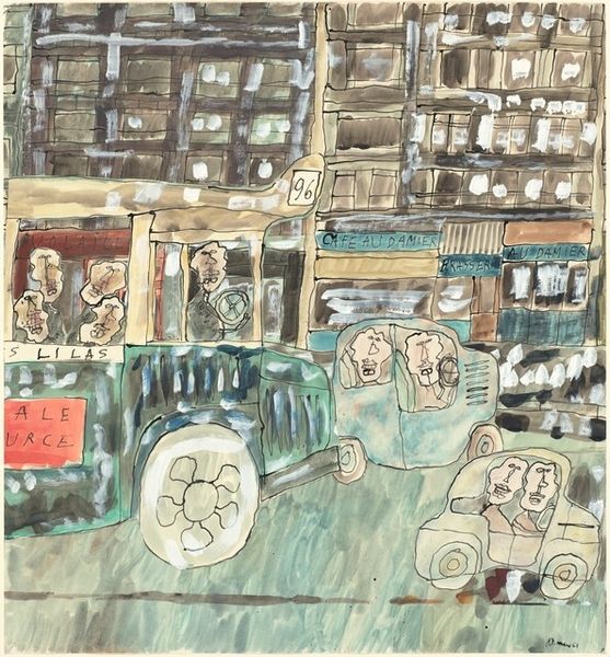
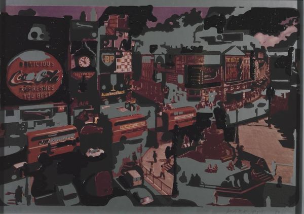
Curator: I find myself quite charmed by this graphic print, titled "Fruit Cart," which we believe dates to around 1950. The artist is Margaret Layton, who has cleverly captured a vibrant yet slightly abstracted city scene. Editor: My initial impression is one of carefully balanced chaos. It’s not photorealistic by any means, yet all the elements coalesce to convey an urban landscape – though its melancholic tonality mutes its vibrancy to near obsolescence. Curator: I'm struck by how the artist utilizes familiar signage – "Books," "Furniture," "Rugs" – imbuing the composition with cultural echoes of urban commercial life in the mid-20th century. They trigger familiar narratives of main-street culture. It speaks to how a collective desire gets expressed over and over again by citizens that live alongside one another. Editor: Indeed, notice how Layton employs a restrained colour palette and deliberately flattens the perspective. It moves away from realism in a bid to accentuate a composition of forms, and colour planes and patterns, creating visual rhymes as signs coalesce together—the window bars mirror patterns and shapes inside shops themselves! Curator: The seemingly humble "Fruit Cart" motif holds deeper symbolic weight too, doesn’t it? The bounteous display of fruits can be seen as an ancient symbol of prosperity and even transient beauty, presented now alongside the hard lines of consumer capitalism! I notice the tiny price labels—the tension between traditional values and market economy is so rich. Editor: The structural choices emphasize this point further. By creating multiple planes within a singular plane—window reflections mimicking displays behind glass mirroring street signs as one total object, we’re invited into this paradox and our participation with it too. Layton doesn’t moralize, rather her composition is concerned about the facts, in and of itself. Curator: It makes me think of those colour field paintings! There’s something universally familiar evoked here through layered symbology – that daily dance between sustenance, desire, and consumerism, rendered beautifully in the graphic style and cultural moment Layton presents. Editor: Ultimately, Layton’s approach through flattened colour and graphic stylization delivers a very astute investigation into the nature of mid-century public-oriented visual culture.
Comments
No comments
Be the first to comment and join the conversation on the ultimate creative platform.
More like this