drawing, coloured-pencil, plein-air, watercolor, ink
drawing
coloured-pencil
plein-air
landscape
watercolor
ink
coloured pencil
romanticism
watercolor
Copyright: Public Domain
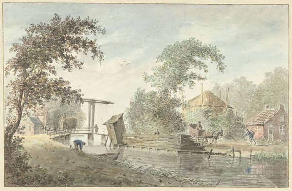
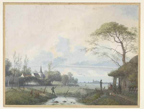
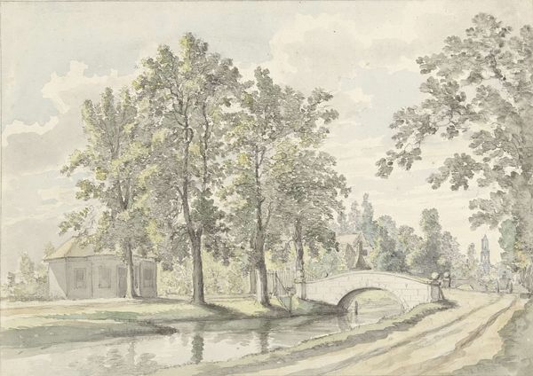
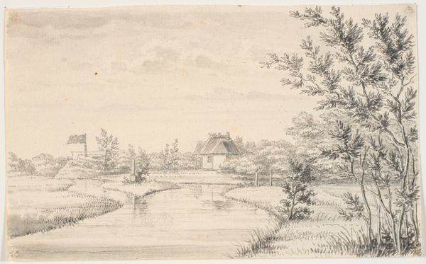
Editor: This watercolor and ink drawing, "View of Baambrugh" by Johannes de Bosch, presents such a calm scene. The textures created with what looks like colored pencil and fine lines of ink give it a very detailed yet airy quality. What strikes you first about the formal elements in this landscape? Curator: The structural arrangement is quite striking. The artist creates a strong diagonal line that sweeps from the lower left corner to the upper right, guiding the eye. This trajectory is reinforced by the placement of the figures, the road, and the architecture, set against the tranquil reflections in the water which echoes the sky above. Editor: That's a helpful observation! I hadn't considered the diagonal. Can you elaborate on the use of color and its impact on the piece? Curator: Note the restricted palette; the dominance of earth tones – muted greens, browns, and blues. This creates a harmonious unity throughout the composition. It's interesting to observe the subtle gradations in color, particularly in the sky. How does that contrast with the heavier pigments of the trees and structures? Editor: I see what you mean. The density of color grounds the image, while the transparency of the washes in the sky brings lightness and a sense of expansiveness. Curator: Precisely. De Bosch employs a balanced interplay of color and value to render this idyllic scene. It exemplifies the period's prevailing artistic concerns, don't you agree? Editor: I do. Thanks, looking at it from the perspective of structure and use of the elements makes a whole new level visible! Curator: Indeed. These underlying formal choices yield endless avenues to interpret the work's aesthetic design.
Comments
No comments
Be the first to comment and join the conversation on the ultimate creative platform.