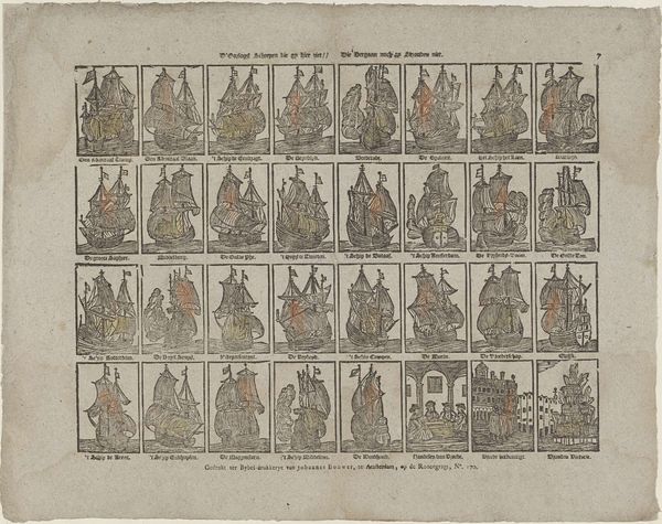
graphic-art, print, engraving
#
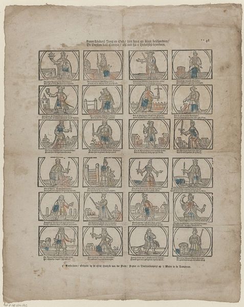
portrait
#
graphic-art
# print
#
genre-painting
#
engraving
#
miniature
Dimensions: height 372 mm, width 325 mm
Copyright: Rijks Museum: Open Domain
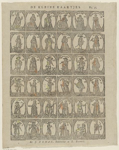
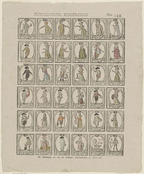
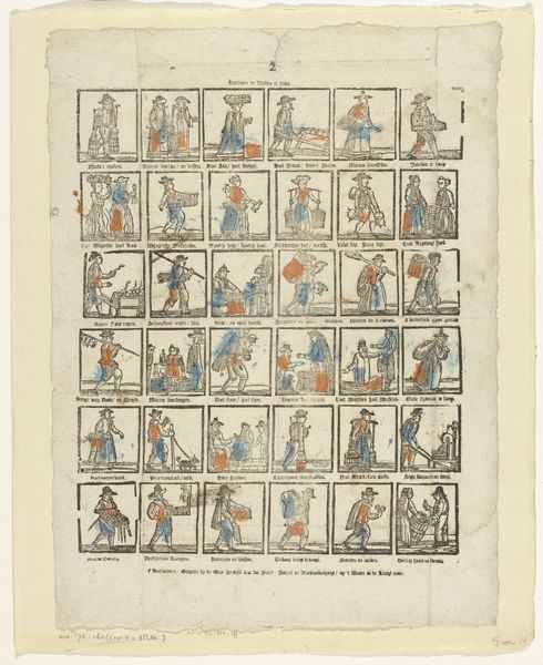
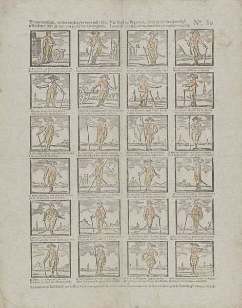
Curator: This captivating piece, entitled "Floskaartjes," dates back to sometime between 1781 and 1821, conceived by Jan Hendriksen. It's presented as an engraving, belonging to a wider trend of genre painting within graphic arts of that time. Editor: My immediate impression is one of charming rigidity. The neat grid, the almost comical solemnity of each character, creates a playful, if slightly unnerving, effect. And the restricted color palette! What story does it whisper? Curator: Well, "Floskaartjes" translates to "Silk Cards", hinting that these may have been part of a game or an educational tool marketed towards children from wealthier families. The print displays thirty-six numbered characters from varied social positions. These are ordered according to a social hierarchy that would have seemed very natural to the 18th-century Dutch society. Editor: The ordering certainly brings to mind societal structures! Notice the restricted but elegant color scheme; the lines and shading emphasize the texture of the paper and bring forth the shapes in simple geometric terms, highlighting both precision and inherent material limitations. Is the intent merely documentation? Curator: I wouldn’t reduce it to documentation. Hendriksen’s work served as a form of social conditioning. This wasn't just entertainment; it was teaching children about their place within the complex social strata of the era. Each miniature portrait reflects the visual cues that signaled rank, class and presumed qualities and responsibilities of certain characters. Editor: Looking closely, you see a series of carefully constructed shapes depicting posture and expression. Each card uses similar lines but subtly distinct angles, creating character archetypes in miniature. Is that uniformity a statement in itself, a way of flattening hierarchies or rather reinforcing common behaviors? Curator: Reinforcement, definitely. The intention wasn’t to subvert, but to perpetuate existing social norms through an easily digestible visual medium. It's a reminder of the power embedded in seemingly harmless cultural objects. Editor: Thinking about it formally then, each frame presents a structured reality, teaching decorum as much as delight, all bound together as one unifying and almost self-referential tableau! It’s quite impressive how much can be communicated by a visual code in this sort of framed form. Curator: It truly encapsulates how even children's games reflected, and therefore perpetuated, the dominant ideology of the time. Editor: Yes, considering those lines, hues, and that composition within its period, this seemingly innocent set reveals such controlled and constructed perspective!
Comments
No comments
Be the first to comment and join the conversation on the ultimate creative platform.
More like this