print, textile, typography, engraving
#
script typography
#
hand-lettering
#
baroque
# print
#
hand drawn type
#
hand lettering
#
textile
#
typography
#
fading type
#
stylized text
#
thick font
#
handwritten font
#
classical type
#
engraving
#
small lettering
Dimensions: height 281 mm, width 380 mm
Copyright: Rijks Museum: Open Domain
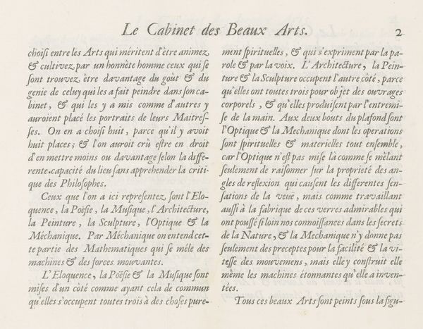
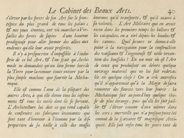
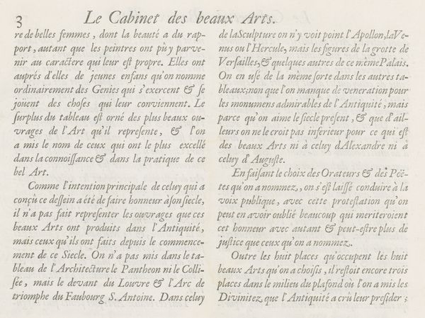
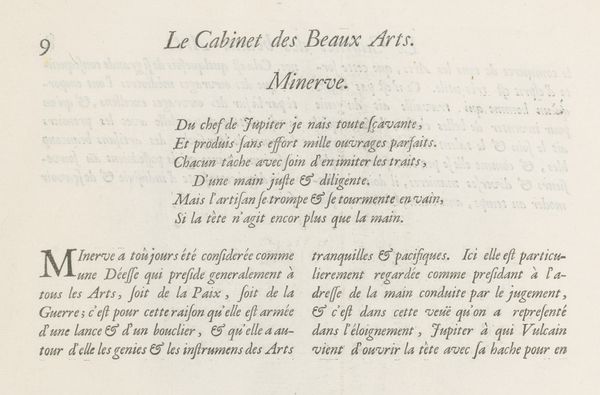
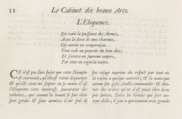
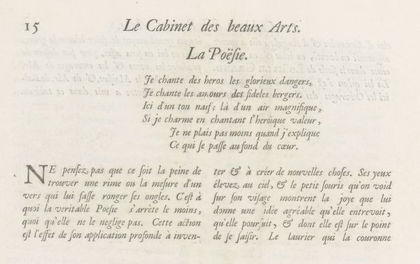
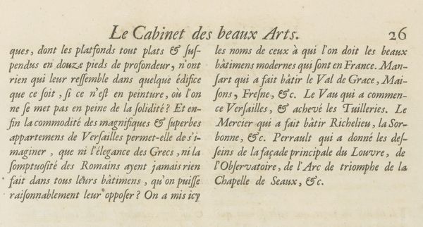
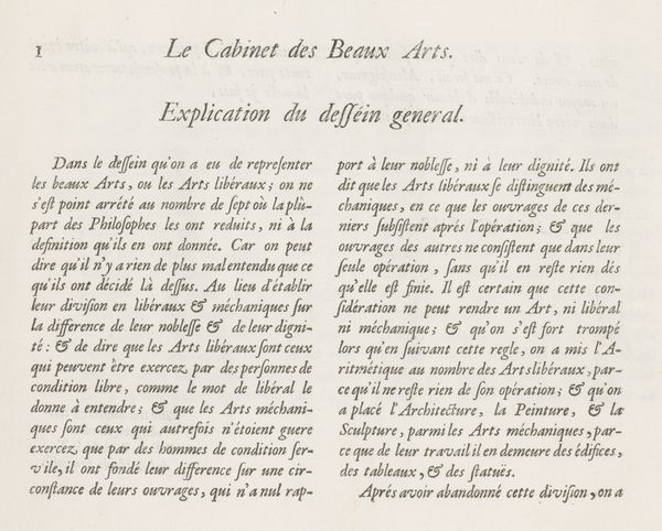
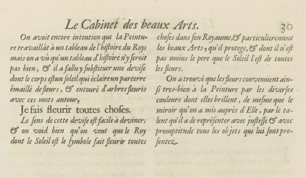
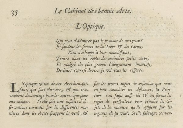
Curator: This print, dating back to 1695, is entitled "Tekstblad met verklaring van de prent over Welsprekendheid, p. 13"—or, "Text page with explanation of the print on Eloquence, p. 13". The author is Charles Perrault. What strikes you first about it? Editor: The density! It's a wall of meticulously crafted text. It has a strangely calming effect; the neat columns of type create a certain rhythm. Curator: Absolutely. Formally speaking, the work exemplifies Baroque typography. The elegant flourishes and stylized lettering are immediately apparent, notice especially the elaborate ampersands. The page is from a book explaining fine prints, aiming to instruct the viewer in eloquence, using beautiful language to express the value of eloquent writing. Editor: Yes, but consider the historical context. This piece was created in an era where eloquence was closely tied to power and social standing. Only those who possessed economic freedom would have had the skills, time, and means to write or have any form of access to reading such things. How might an individual with no privileges read these kinds of text? Curator: A valid point. Yet, I argue that we must also appreciate the work for its sheer artistry. The designer uses various sizes of fonts and sophisticated capital lettering to create a hierarchy, all serving to visually communicate its ideas. Editor: But whose ideas are amplified, and whose are silenced? In the 17th century, most women and the working class would have been excluded from this "eloquence," which served to uphold the existing power structures. Understanding art also entails scrutinizing what the subject omits. Curator: Indeed. However, one could also argue Perrault's work participates in a broader cultural effort to refine and elevate language, fostering intellectual and artistic standards—standards by which we continue to measure written works today. Editor: Perhaps. And my contention remains that even aesthetic refinement cannot be separated from the realities of social power. It seems both of our analyses have served to demonstrate the many layers of interpretation inherent to any piece of art. Curator: I agree wholeheartedly.
Comments
No comments
Be the first to comment and join the conversation on the ultimate creative platform.
More like this