print, typography
# print
#
11_renaissance
#
typography
#
history-painting
Dimensions: height 281 mm, width 380 mm
Copyright: Rijks Museum: Open Domain
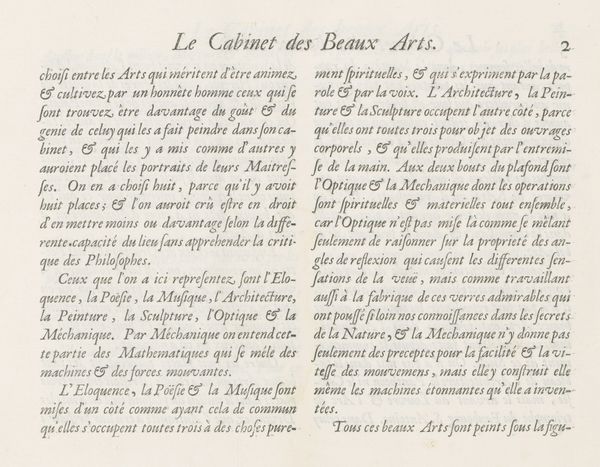
Curator: Today, we are observing a print dating back to 1695, titled "Tekstblad met verklaring van de prent over Architectuur, p. 23" from Charles Perrault. Immediately, the neatness and clarity of this 17th-century text impress me, there is a structured, almost architectural layout to the fonts themselves! Editor: I see more than mere fonts at work; there are some symbols in there, most repeated is a mirrored "&" - a double ampersand which holds particular emotional meaning. These images aren't purely communicative, it lends a humanistic element. The "&" unites words, and symbolizes the bonds between different intellectual pursuits being discussed. Curator: Interesting. Looking closer at the letterpress, I am drawn to the intentionality. The choice of paper, the depth of impression, speaks volumes. Each page was individually pressed, representing the labor and precision involved in disseminating ideas during that era. Even now, it conveys this almost architectural form with these concrete, reproducible symbols. Editor: That very point is critical. Beyond the physicality, the printed words allude to classical architecture and power, drawing symbolic links between rulers and builders. Consider how "Architecture augmente encor des Roys l'auguste majesté." - the architectural form itself mirrors and enhances majesty! Curator: Indeed. And that line continues with "Elle confulte l'Aftronomie, l'Optique, la Medecine & la Jurisprudence...", stressing interdisciplinary aspects central to Perrault’s thinking. These symbols weren’t randomly compiled. Rather they are carefully manufactured and considered together, a demonstration of skill to produce these meaningful connections. Editor: Precisely. These carefully-chosen images point back toward an elaborate ideology around design and rule. What this particular text offers, it appears, is an illustration through both explicit text, and typographic, symbolic associations of cultural priorities in its moment of making. Curator: Examining the materiality then—paper, ink, type—provides rich insight to grasp the physical work in spreading its central idea. This "Tekstblad" illustrates not only architectural philosophy, but also embodies printing production techniques, in their specific socio-economic framework of making culture. Editor: Yes, it's in effect a blueprint – in symbolic, textual form. And a reflection, through considered use of symbols and language. It's also worth bearing in mind, given our discussion of its making and historical meanings, its continuing power, these typographic forms are with us centuries after they were originally set. Curator: Seeing how the production choices influenced the content and contributed cultural value broadens my understanding, especially with typography like this being such a fundamental material aspect! Editor: And through our discussions, the image's echoes have given it yet new symbolic meaning, layered over previous intentional design!
Comments
No comments
Be the first to comment and join the conversation on the ultimate creative platform.
More like this