drawing, ink
#
drawing
#
enamel pin design
#
childish illustration
#
cartoon like
#
cartoon based
#
vector art
#
animated style
#
animated character
#
figuration
#
flat colour
#
ink
#
vector illustration
#
abstraction
#
cartoon style
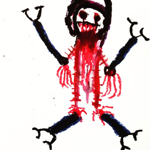
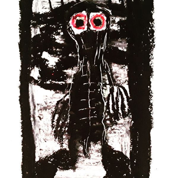
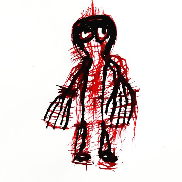
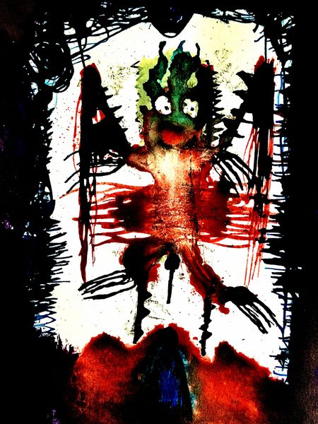
Dimensions: 20 x 25 cm
Copyright: Thomas Riesner,Fair Use
Editor: This drawing from 2019, titled "Untitled," is by Thomas Riesner and made using ink. I’m immediately struck by its raw energy. It looks like a character straight out of a nightmare. How do you interpret this work, focusing on its formal elements? Curator: Considering it purely through form, notice the stark contrast. Black ink dominates a bright white ground, creating high visual tension. The figure is relatively symmetrical in shape. What purpose do you think the repetition of line and form serves? Editor: I guess it exaggerates the figure's spikiness. Those linear elements give it a sort of dangerous edge? Curator: Precisely. Consider also how the texture of the ink contributes. It is unevenly applied in layers of black, punctuated by stark dashes of red. Note that the arms holding what appears to be walking sticks form strong diagonal lines. How do these diagonals impact your reading of the image? Editor: It feels dynamic, not static. Like the figure is leaning forward or about to move. It does appear to defy perspective... there are other abstract and geometric shapes filling negative space between and under it as well. Curator: Exactly! And beyond simple observation, consider how these aesthetic qualities generate the disquiet you initially noted. The roughness, the jagged edges, the unsettling gaze—these elements cohere to produce that effect. How do those red dots disrupt or complement the lines of the body? Editor: The red seems like an accent. Adding just enough chaos to what might otherwise seem like a child's sketch? It intensifies the ominous mood significantly. Curator: Indeed. We see how a careful articulation of form, composition, and line converge. The visual grammar and the texture, coalesce into an emotive representation. Thank you. Editor: Thanks. Focusing on formal aspects really helped unlock the feeling the artwork was projecting.
Comments
No comments
Be the first to comment and join the conversation on the ultimate creative platform.
More like this