# print
#
landscape
#
figuration
#
naive art
#
abstraction
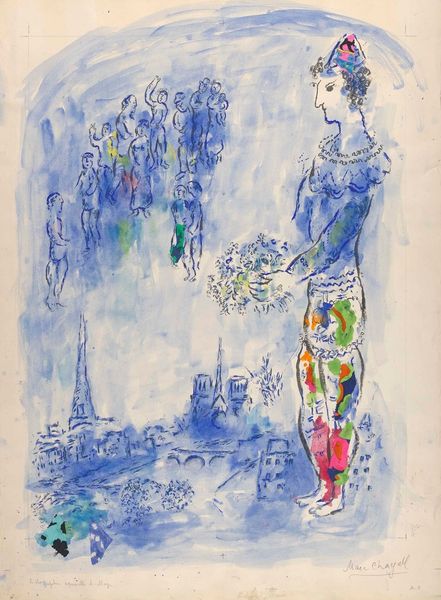
Dimensions: overall: 35.2 x 26.4 cm (13 7/8 x 10 3/8 in.)
Copyright: National Gallery of Art: CC0 1.0
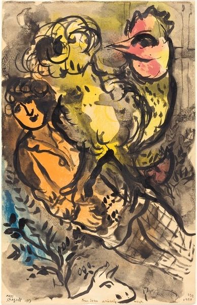
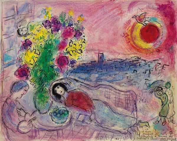
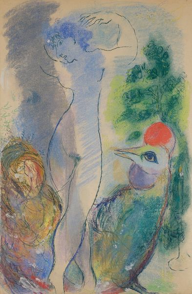
Curator: What a wash of blue and dream-like whimsy. A playful Fauvist rendition, maybe? Editor: I’m drawn in by the composition. This lithograph, titled “Place de la Concorde,” was created by Marc Chagall in 1952. It shows his typical style. He moved to France seeking artistic freedom, a world away from Russia. His early paintings in France brought recognition from French avant-garde artists like Robert Delaunay. This print really epitomizes that journey, don’t you think? Curator: Absolutely. There's an emotional honesty in the composition. A massive, spectral figure floats over the scene; is that supposed to be us looking at the monument? The colors are vibrant but there's a hazy feeling, an abstract figure reminiscent of those he developed early in his career. There's that intense flattening effect and spatial ambiguity—the buildings merge into each other—very similar to Braque. It all melds together to create a powerful expressionistic composition. Editor: Interesting that you mentioned the flatness. It suggests a move away from purely representational art after the World War II period. Chagall, through the creation of artworks such as these, and their ensuing fame, further establishes Paris as this creative mecca and artistic well-spring, in part, because of artists seeking freedom from persecution in places like his home of Vitebsk, now modern-day Belarus. Curator: Yes, its historical position really can't be understated. Though, for me, it's all about his manipulation of color here— the dreamy quality is accentuated with these broad blues with softer tones of pink and green—his unique vision makes the familiar feel very dreamlike. Look at the line work here, how would you define the mark making? Editor: Well, it almost mimics automatic drawing—sketchy, unfinished but still suggesting recognizable form like the Eiffel tower or buildings, though simplified. It creates a light-hearted and carefree impression. These loose lines paired with soft but vivacious colors creates a childlike style but, it would be an oversight to miss that this child is extremely refined and talented! The figures have these big exaggerated shapes; it's joyful. Curator: Yes, playful! Ultimately, Chagall manages to find light after darkness through the development of these compositional strategies and choice in color palette, doesn’t he? Editor: It feels so spontaneous—you get a true sense of Chagall’s artistic voice, reflecting that cultural history. I’m compelled by the immediacy of the piece, considering the man behind its creation.
Comments
No comments
Be the first to comment and join the conversation on the ultimate creative platform.
More like this