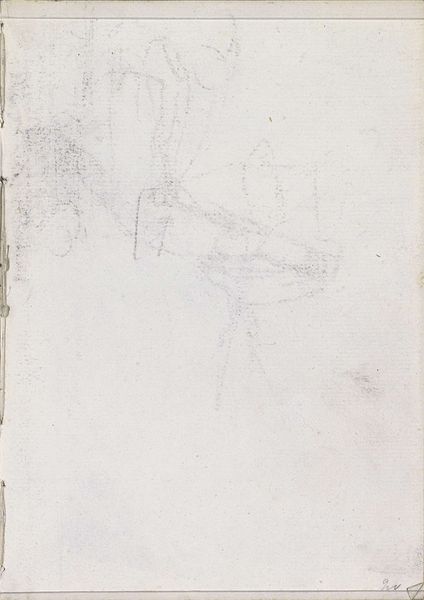
drawing, paper, pencil
drawing
paper
geometric
pencil
abstraction
Copyright: Rijks Museum: Open Domain
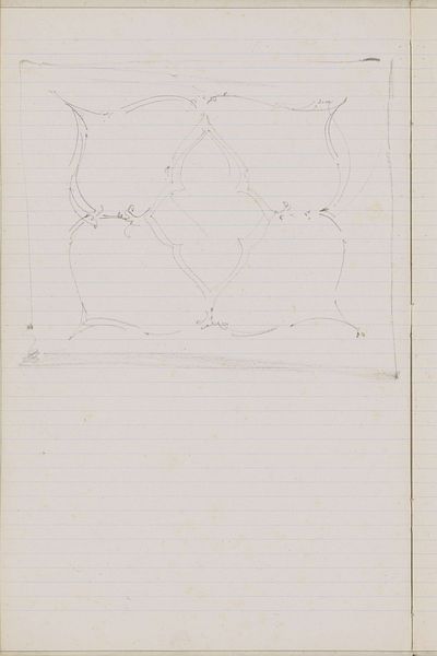
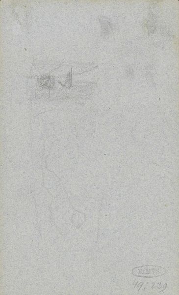
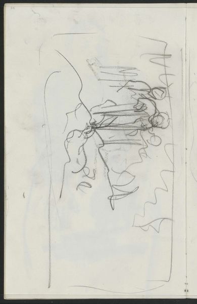
Editor: So, here we have "Abklatsch van een krijttekening," which translates to something like "copy of a chalk drawing," by Gerrit Willem Dijsselhof, from around 1901. It's a pencil drawing on paper, currently residing at the Rijksmuseum. My first impression is… architectural, maybe a bit like a faded blueprint. What do you see in this piece, someone who isn't as amateur as me? Curator: Amateur? Nonsense! You have sharp eyes. It *is* architectural, in a way, but I find myself drifting towards the abstract. The geometric shapes feel almost like a code, don't they? Dijsselhof was incredibly interested in the decorative arts; this could very well be studies for, say, a stained-glass window, a tiled floor, or even a wallpaper pattern, fragmented like memories or a dream. There’s a tentative quality, a searching – as if Dijsselhof’s figuring out the puzzle along with us. What strikes you most about the use of line here? Editor: That tentativeness, definitely. It doesn't feel forceful. And now that you mention it, I see a sort of rhythm, especially with the repeated hexagons. But is that abstraction common for this time period? It feels so modern. Curator: Ah, precisely! Around 1900, artists were itching to break free, to express inner realities rather than merely reflect outer appearances. Think of Mondrian’s early experiments; Dijsselhof was part of that same restless spirit. It's as though the image is dissolving even as it's forming. Perhaps this work has made you question what’s considered “finished?” Editor: Definitely! It’s like a glimpse into the artist's process. It felt incomplete at first glance but thinking about it, that gives it character. Thanks, I see it in a different light now. Curator: It’s funny, isn’t it? How a drawing, so light, so ephemeral, can teach us to look more deeply.
Comments
No comments
Be the first to comment and join the conversation on the ultimate creative platform.