drawing, paper, ink
#
drawing
#
type repetition
#
script typography
#
hand-lettering
#
ink paper printed
#
old engraving style
#
hand drawn type
#
feminine typography
#
paper
#
ink
#
hand-drawn typeface
#
thick font
#
coloring book page
#
calligraphy
Copyright: Rijks Museum: Open Domain
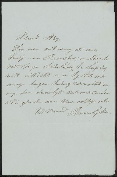
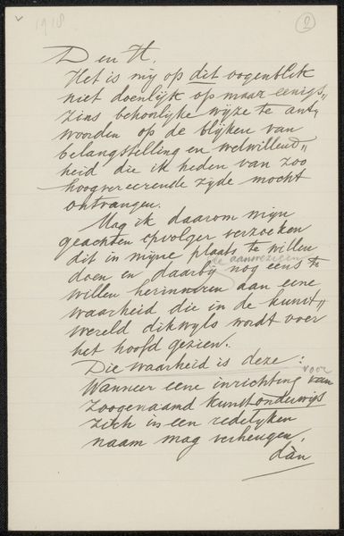
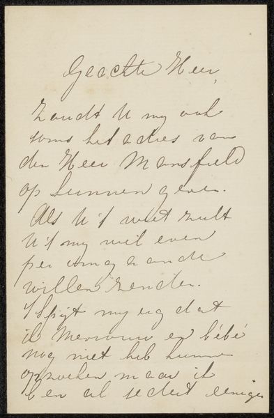
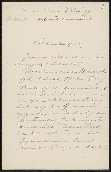
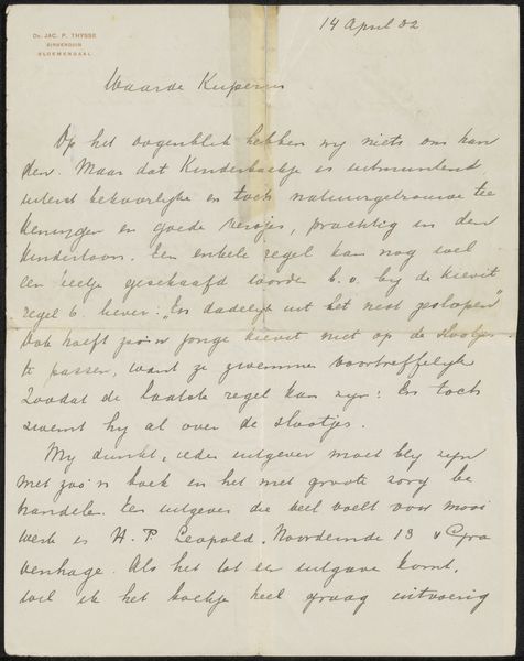
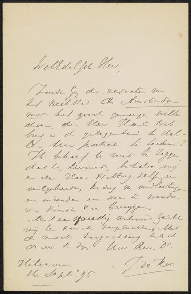
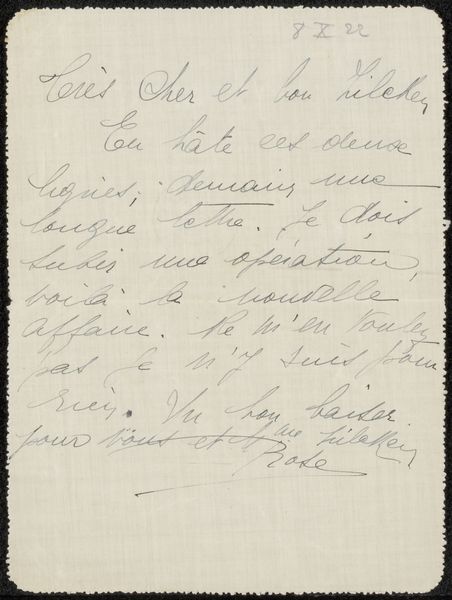
Curator: Today we are exploring "Brief aan Jan Veth," a fascinating piece tentatively dated to 1889. It's a drawing, ink on paper, by André Jolles. What’s your first take on it? Editor: Intimate. Vulnerable, even. It’s the kind of script that suggests hurried thoughts, yet carefully formed. I wonder, is it just me or is there a melancholy undercurrent here? Curator: The handwriting certainly speaks to the moment it was created – hurried, personal, no pretense. In the realm of graphic communication, handwriting preserves intimacy. We feel close to the artist's thoughts as we read. Editor: Absolutely! You feel the humanity in the imperfect letterforms, don't you? There's an attempt at formality that fights with a practical, no-frills aesthetic, like you might want a fancy seal, but end up using clear tape on an envelope. Curator: Precisely. Jolles is conveying more than just the words, wouldn’t you say? There’s the context. Think about how we pour over old letters searching for some residue of lived reality, a glimpse into a world of shared emotions. Editor: The layout itself, I think, tells a story. Notice the positioning of the date, almost floating in the top right corner. It acts as an anchor, setting the tone like an important clue to decipher. But what did it say about this lost time and context? It is lost to us, not written out here. Curator: Yes! And look at the generous margins, framing the message. That empty space is part of the communication too. Editor: It almost amplifies the words, making them echo somehow. Like listening to a whispered secret in a vast, empty room. A secret message intended for Jan, of course, now accidentally released to the winds for anyone to catch and imagine its history. The words written might be a little harsh to be read even now in this space; they aren't quite glowing endorsements! Curator: Yes, that is why looking at the whole thing provides such insight: it shows the image of a complex thought being revealed in multiple visual symbols and graphic arrangements. What resonates for me, thinking about it now, is how a simple letter, ink on paper, bridges eras and offers us such a tangible sense of connection to the past. Editor: I concur. It reminds me of how physical artefacts retain emotional imprints. Like picking up an antique book and sensing the hundreds of eyes that have scanned its pages. “Brief aan Jan Veth” feels heavy with unspoken stories, carried through time on the wings of typography.
Comments
No comments
Be the first to comment and join the conversation on the ultimate creative platform.
More like this