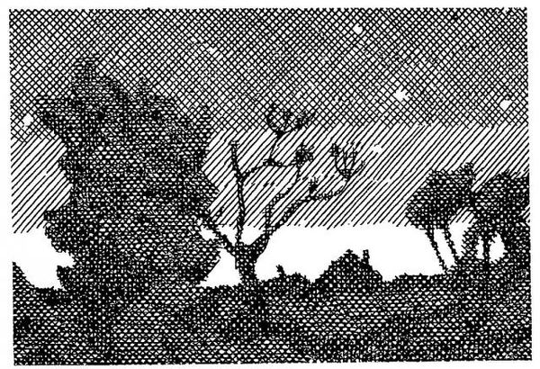
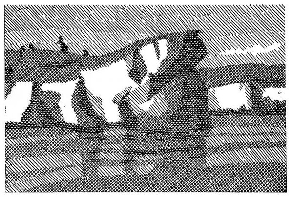
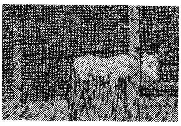
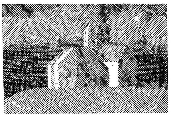
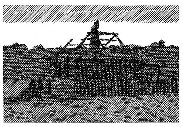
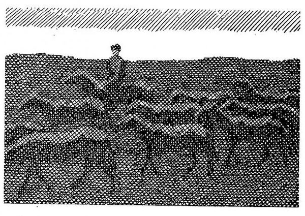
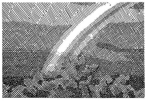
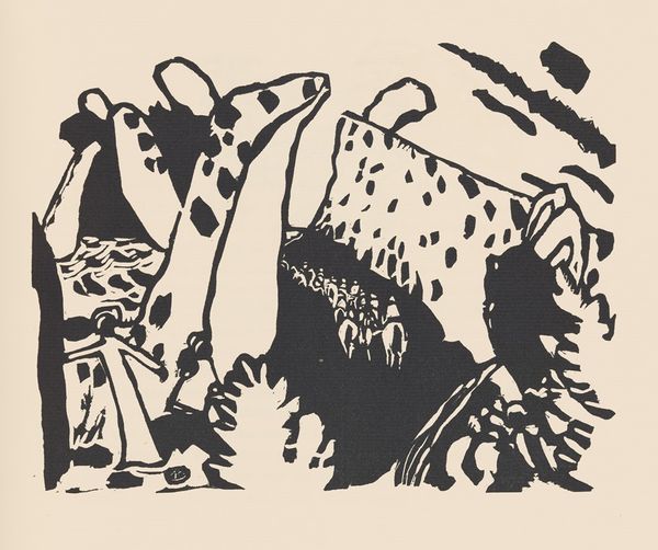
Illustration for the collection of short stories by Yevhen Gutsal "In the stork village" 1969
0:00
0:00
drawing, paper, ink
#
drawing
#
line-art
#
narrative-art
#
neat line work
#
pattern
#
landscape
#
crosshatching
#
junji ito style
#
figuration
#
paper
#
ink line art
#
linework heavy
#
ink
#
dark black outline
#
geometric
#
thin linework
#
intricate pattern
#
intricate and detailed
#
monochrome
Copyright: Hryhorii Havrylenko,Fair Use
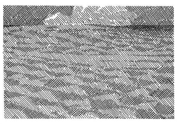
This black and white illustration was made by Hryhorii Havrylenko, to accompany Yevhen Gutsal’s short stories about a stork village, but when? The image is built up from a system of fine cross-hatching, creating an almost dizzying effect of light and shadow, figure and ground. It reminds me of Sol LeWitt's wall drawings in its systematic application of line, and in its commitment to the monochrome. See how the birds are defined not just by their outlines, but by the absence of hatching? The landscape is suggested by a dense, almost chaotic network of strokes, while the sky is rendered with a more open, linear approach. It’s as though the artist is mapping the world through the language of mark-making. This systematic approach invites us to see the world as a network of interconnected lines, each with its own direction and density, its own weight and rhythm.
Comments
No comments
Be the first to comment and join the conversation on the ultimate creative platform.
More like this