![Untitled [plate XXXIX] by Joan Miró](/_next/image?url=https%3A%2F%2Fd2w8kbdekdi1gv.cloudfront.net%2FeyJidWNrZXQiOiAiYXJ0ZXJhLWltYWdlcy1idWNrZXQiLCAia2V5IjogImFydHdvcmtzLzhjNGE1MjMxLTJlZWUtNDFkNS05OTliLTk0YmRiNTU1NDcyZS84YzRhNTIzMS0yZWVlLTQxZDUtOTk5Yi05NGJkYjU1NTQ3MmVfZnVsbC5qcGciLCAiZWRpdHMiOiB7InJlc2l6ZSI6IHsid2lkdGgiOiAxOTIwLCAiaGVpZ2h0IjogMTkyMCwgImZpdCI6ICJpbnNpZGUifX19&w=1080&q=75)
mixed-media, print, paper, ink, pastel
#
mixed-media
#
ink paper printed
# print
#
pop art
#
pastel colours
#
paper
#
ink
#
geometric
#
abstraction
#
watercolour illustration
#
pastel
#
surrealism
Copyright: National Gallery of Art: CC0 1.0
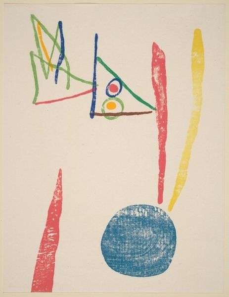
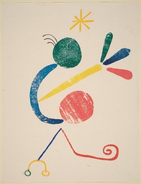
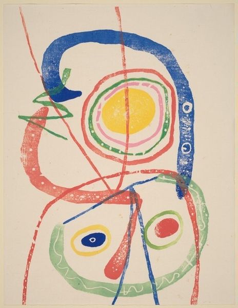
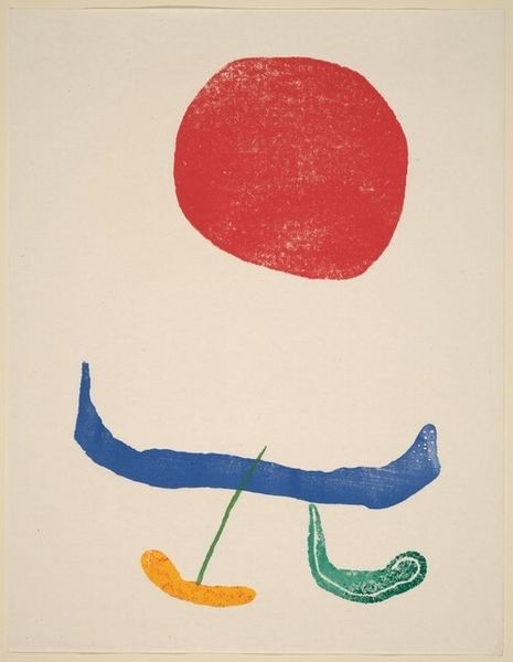
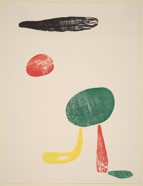
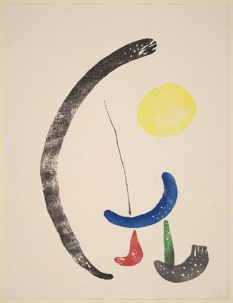
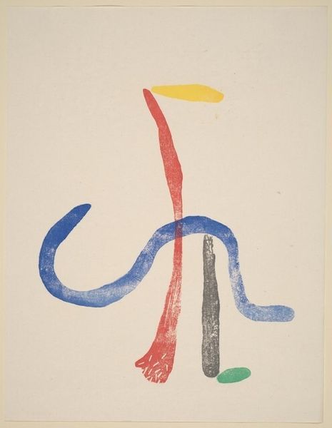
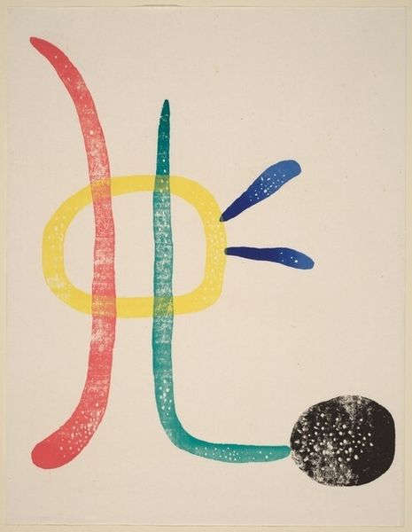
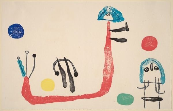
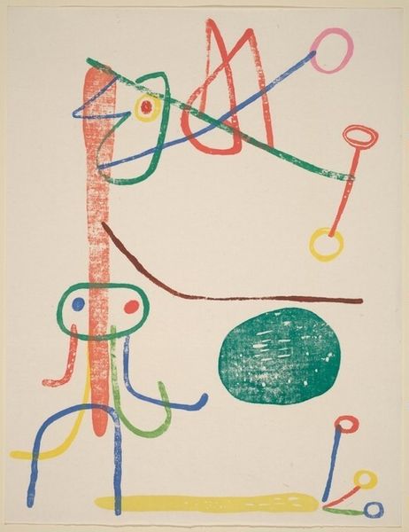
Joan Miró made this Untitled print using lithography, a process that invites experimentation and play. Look at how the shapes hover on the surface, each rendered in flat, vibrant color. The red circle near the top left, has these tiny imperfections, almost like a worn stamp, giving it a tactile quality that contrasts with the clean lines around it. I find myself focusing on the bottom left, where the combination of red, blue and green is almost like a little face emerging from pure abstraction. Miró’s use of color and form reminds me of Paul Klee, another artist who wasn't afraid to embrace simplicity and whimsy. Both artists share a kind of visual language that feels both deeply personal and universally accessible, full of ambiguity. It's like they're whispering secrets that we can almost understand, but never quite grasp fully, and that's what keeps us coming back for more.
Comments
No comments
Be the first to comment and join the conversation on the ultimate creative platform.
More like this