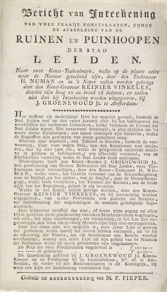
Bericht van de uitgave van de twee platen van de verwoestingen door de buskruitramp te Leiden, 1807 1807
0:00
0:00
johannesgroenewoudjansz
Rijksmuseum
print, etching, typography, poster, engraving
#
neoclassicism
# print
#
etching
#
old engraving style
#
typography
#
stylized text
#
poster
#
engraving
Dimensions: height 220 mm, width 130 mm
Copyright: Rijks Museum: Open Domain
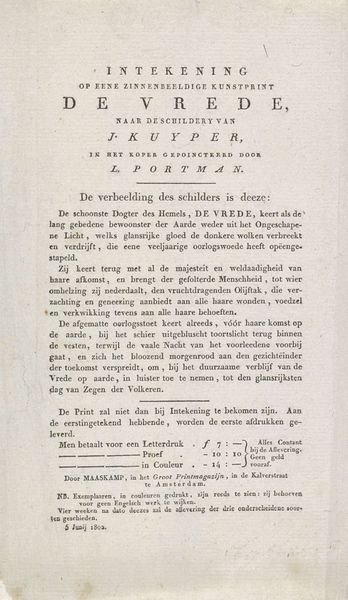
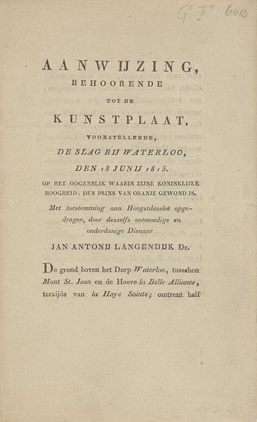
Curator: This is an announcement, titled "Bericht van de uitgave van de twee platen van de verwoestingen door de buskruitramp te Leiden, 1807." It commemorates the gunpowder explosion in Leiden that year, rendered as an engraving. Editor: Immediately, it gives me the feeling of fragility. All of this weight hangs precariously because of the typography's arrangement on the page, and I know we are talking about a tragic, delicate subject of both human loss and damage. Curator: That fragility is mirrored in the technique. Etching allows for a very fine line, capturing the devastation with what I think is intended as forensic detail and neoclassical ideals. The letters almost seem stamped with meticulous care, reminiscent of broadsides with their bold declarative texts. It would have been a method accessible to the working class. Editor: It makes me wonder about the printer, Johannes Groenewoud Jansz. The announcement foregrounds his role and implies the authority granted by the city council ("Met Approbatie van de Ed. Achtbare Heeren Wethouderen der Stad Leiden"), underscoring the relationship between making and capital investment. I'm fascinated by the way print makes grief into commodity, and it seems it does so very explicitly here with "Twee Extra Fraaie Kunst-Plaaten". Curator: The visual language reinforces these official associations. Typography becomes symbolic, acting as a marker of an event in the social consciousness. You can imagine people encountering this announcement, recognizing its aesthetic language, and associating it with official documentation. These typefaces speak volumes! Editor: Absolutely. But it also points to a deeper function, to memorialize the event for continued consumption in homes, on walls. A stark, legible reminder rendered in ink and paper, invoking authority and mass participation with affordable printed versions next to higher-priced "proof" prints. It poses a complex social calculus! Curator: It seems we both found in this printed record a complex interplay between emotional expression, artistic labor, and a collective grappling with devastating tragedy. Editor: It offers so much when you begin to consider the economics involved, the labor to produce, and the role in communal grieving during peacetime, especially via typography as a public symbol.
Comments
No comments
Be the first to comment and join the conversation on the ultimate creative platform.
