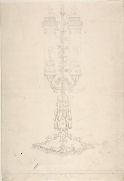
drawing, metal, pencil
#
drawing
#
neoclacissism
#
hand written
#
script typography
#
hand-lettering
#
metal
#
hand drawn type
#
hand lettering
#
form
#
hand-drawn typeface
#
fading type
#
pencil
#
stylized text
#
thick font
#
line
#
decorative-art
#
small lettering
Dimensions: height 274 mm, width 206 mm
Copyright: Rijks Museum: Open Domain
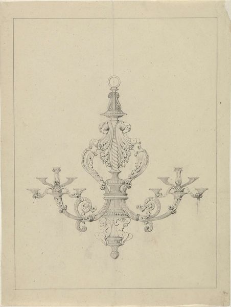
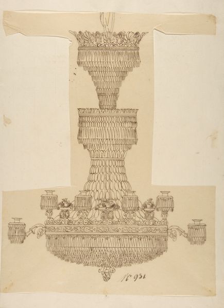
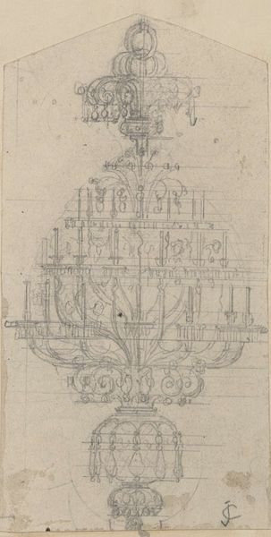
Curator: This drawing presents a design for a chandelier, dating back to approximately 1830 to 1840, attributed to Firma Feuchère. It's rendered in pencil, with what seems to be a focus on metal construction. Editor: It strikes me as exceptionally elaborate, almost dreamlike. The tiered structure feels quite imposing, even in sketch form. I notice the emphasis on symmetry; how intentional would you say the placement and visual weight were within such a complicated schematic? Curator: The symmetry isn’t merely aesthetic, but deeply rooted in Neoclassical principles prevalent at the time. Grand interiors of the era demanded balanced ornamentation, reflecting social order. Such symmetry signified the control, rational thought, and power asserted through architecture and interior design within aristocratic and emerging bourgeois spaces. Editor: Those delicate, looping tendrils repeated across the piece—I wonder about their origin. Are they merely ornamental, or might they be hinting at deeper ideas present during the period, and embedded in the very concept of luxury lighting? Curator: The floral and foliate motifs were staples of the decorative arts, drawn from a long tradition reaching back to antiquity, and consistently reinterpreted throughout decorative periods, serving here to soften the rigid geometry of the chandelier’s frame. Symbolically, light has always carried strong positive associations, so the addition of organic imagery enhances its life-affirming qualities within the home. Editor: You mentioned power and control through symmetry earlier, I now see those two ideas subtly opposed in this chandelier. Such detail conveys, on another level, a sense of hopeful bounty—these interwoven details bring vitality into artificial light. Were similar artistic elements common in public spaces, as well? Curator: To a point, yes. The degree of detail certainly varies according to the setting and, naturally, the budget allocated. Public commissions aimed to impress but within set parameters deemed appropriate for state or civic representation, where the language used would adhere closely to prescribed stylistic trends for maximum political effect. Editor: Interesting. Looking at this drawing I start to feel how far removed this kind of artistic piece is to modern industrial design. Curator: Absolutely, and it highlights the degree to which design, even in seemingly ‘decorative’ objects like this chandelier, is always communicating more than its immediate function. Editor: I appreciate how our journey revealed embedded aspects of historical periods expressed through symbolism, something not easily gleaned at first sight. Curator: Indeed. Objects like this drawing become rich sources once we understand their context within historical, social, and political landscapes.
Comments
No comments
Be the first to comment and join the conversation on the ultimate creative platform.
