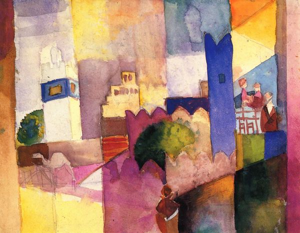
watercolor, architecture
#
cubism
#
water colours
#
watercolor
#
geometric
#
line
#
modernism
#
architecture
Copyright: Public domain
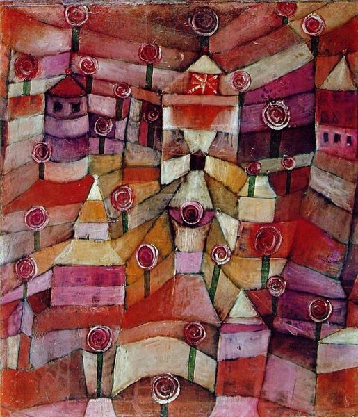
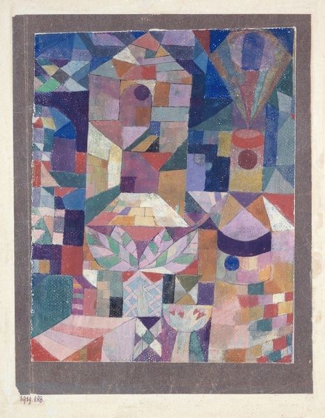
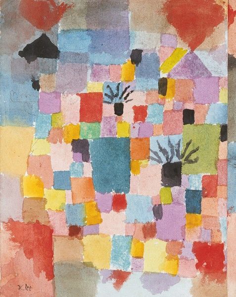
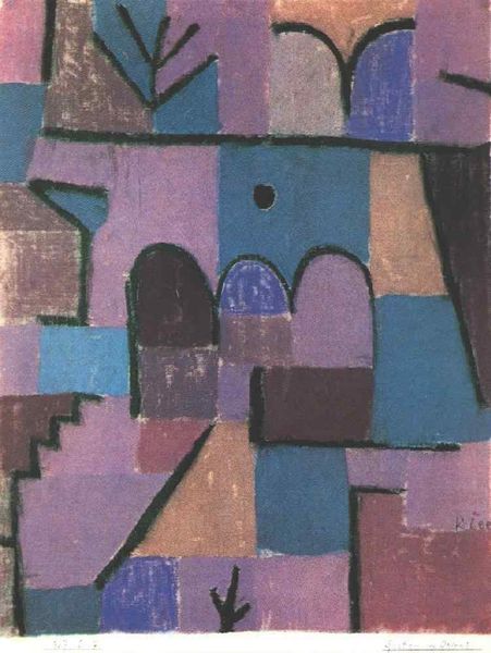
Editor: Welcome! We’re looking at “Flora on rocks Sun,” a 1940 watercolor by Paul Klee. The blocks of color and the arches create a fascinating composition that is somewhat architectural. It's quite striking and the sun gives the impression of heat, yet there is coolness present in the lines too. What’s your take on it? Curator: From a formal perspective, observe how Klee organizes the surface into a grid-like structure. The juxtaposition of rectangular and arched forms creates a compelling visual rhythm. Note the subtle variations in the watercolor washes; how does this interplay of textures contribute to the overall composition? Editor: I see what you mean about the rhythm, it really makes the picture dance a little bit! But what's with the sort of architectural domes? Curator: Precisely! The ambiguous forms resist definitive interpretation, drawing attention instead to their formal arrangement. Are they buildings? Are they flora, as the title suggests? This unresolved tension is key. Also note the "line." Are you able to determine the nature of the 'line' from an iconographical stance? Editor: That makes sense; so rather than getting caught up on the domes or what Klee was trying to say about the architecture or flora, it's more about *how* he arranged the visual components on the surface? Thanks that's interesting, as it almost has a 3d aspect due to Klee's expert choice of visual forms. Curator: Exactly. Our focus remains on the internal relationships of form, color, and texture as a path to appreciation. In essence, you must trust your visual senses and instinct as that informs your feelings toward the work itself. Editor: Wow, I’ll definitely look at Klee, and other abstract works, in a new way now. I thought art was all about meaning, but you’re teaching me to see with new eyes.
Comments
No comments
Be the first to comment and join the conversation on the ultimate creative platform.
More like this