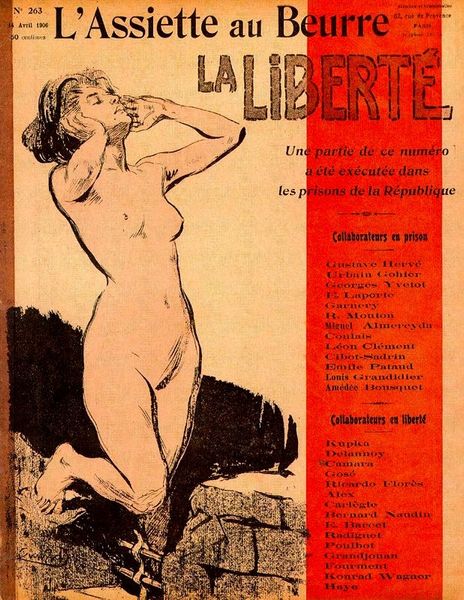
About this artwork
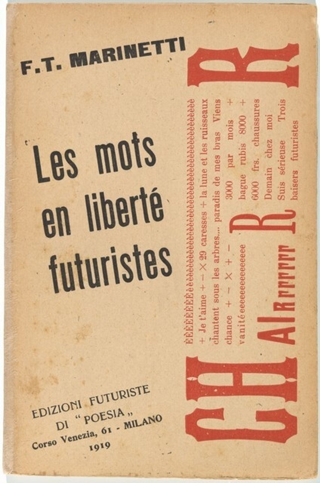
Editor: So, this is Filippo Tommaso Marinetti's "Les mots en liberté futuristes," published in 1919. It looks like a cover for a book or a pamphlet. The material seems like aged paper. It's interesting how the typography itself feels like an expression of freedom, yet also looks mass-produced. What stands out to you? Curator: I’m immediately drawn to the deliberate choice of these particular printing techniques, especially the constraints they place on visual communication. The "aged paper," as you aptly pointed out, speaks volumes. Its texture and feel directly contrast with the Futurists' proclaimed love of the machine age. Why use what seems like old paper stock when you can embrace modern pulp and mass media printing? It also suggests the ephemeral nature of these radical ideas despite their bold presentation. Editor: So you're saying it’s not necessarily about pure aesthetic rebellion, but more about the socioeconomic context of its production? Curator: Precisely. Marinetti’s choice, whether intentional or dictated by available resources, speaks to the limitations and contradictions inherent in even the most forward-thinking movements. Were they really freeing words or shackling them in this presentation? Consider the distribution of this work – was it widely available, or confined to specific circles of avant-garde enthusiasts? Editor: That's a great point; access would definitely impact the meaning. Looking closer, even the layout seems to mimic mass production but it still presents evidence of 'human touch'. Curator: Yes! The materiality confronts us with the conditions of its making. How was this booklet produced? What type-setting and printing presses were accessible at the time? Even those details inform our understanding of this visual experiment. Editor: This makes me rethink the Futurists' bold claims. It appears it's not enough to analyze their manifestos; we must also examine how their art came into being. Thanks! Curator: Absolutely. Examining the means of production, the paper, ink, the entire printing apparatus, grants a deeper, and sometimes contradictory, appreciation of this era's artistic and cultural values.
Les mots en liberté futuristes 1919
Artwork details
- Dimensions
- book: 20.3 x 13.3 x 1 cm (8 x 5 1/4 x 3/8 in.)
- Copyright
- National Gallery of Art: CC0 1.0
Tags
aged paper
hand-lettering
hand drawn type
hand lettering
hand-drawn typeface
fading type
thick font
handwritten font
golden font
historical font
Comments
No comments
About this artwork
Editor: So, this is Filippo Tommaso Marinetti's "Les mots en liberté futuristes," published in 1919. It looks like a cover for a book or a pamphlet. The material seems like aged paper. It's interesting how the typography itself feels like an expression of freedom, yet also looks mass-produced. What stands out to you? Curator: I’m immediately drawn to the deliberate choice of these particular printing techniques, especially the constraints they place on visual communication. The "aged paper," as you aptly pointed out, speaks volumes. Its texture and feel directly contrast with the Futurists' proclaimed love of the machine age. Why use what seems like old paper stock when you can embrace modern pulp and mass media printing? It also suggests the ephemeral nature of these radical ideas despite their bold presentation. Editor: So you're saying it’s not necessarily about pure aesthetic rebellion, but more about the socioeconomic context of its production? Curator: Precisely. Marinetti’s choice, whether intentional or dictated by available resources, speaks to the limitations and contradictions inherent in even the most forward-thinking movements. Were they really freeing words or shackling them in this presentation? Consider the distribution of this work – was it widely available, or confined to specific circles of avant-garde enthusiasts? Editor: That's a great point; access would definitely impact the meaning. Looking closer, even the layout seems to mimic mass production but it still presents evidence of 'human touch'. Curator: Yes! The materiality confronts us with the conditions of its making. How was this booklet produced? What type-setting and printing presses were accessible at the time? Even those details inform our understanding of this visual experiment. Editor: This makes me rethink the Futurists' bold claims. It appears it's not enough to analyze their manifestos; we must also examine how their art came into being. Thanks! Curator: Absolutely. Examining the means of production, the paper, ink, the entire printing apparatus, grants a deeper, and sometimes contradictory, appreciation of this era's artistic and cultural values.
Comments
No comments