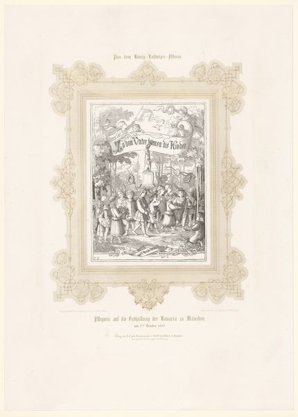
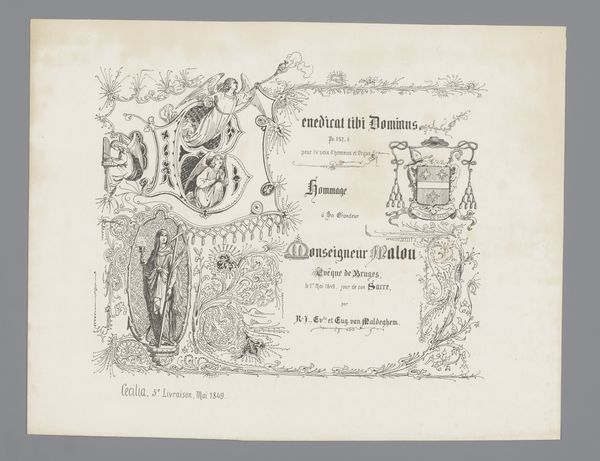
Titelblad til "Halvtredsindstyve gamle Kæmpevise-melodier" 1842
0:00
0:00
graphic-art, lithograph, print
#
graphic-art
#
medieval
#
lithograph
# print
#
romanticism
#
genre-painting
#
decorative-art
Dimensions: 280 mm (height) x 375 mm (width) (bladmaal)
Curator: Here we have Lorenz Frølich's title page for "Halvtredsindstyve gamle Kæmpevise-melodier," created in 1842. It’s a lithograph, currently housed at the SMK in Copenhagen. Editor: The intricate frame immediately catches my eye. The dark lines against the off-white paper create a nostalgic, almost fairytale-like quality. It feels very illustrative and decorative. Curator: Indeed. The materiality of the lithograph, a relatively new technology at the time, allowed for detailed reproduction. Consider its context: this title page served to introduce a collection of old heroic ballads. These songs likely circulated amongst working class Danes, evoking a sense of shared history and national identity at a time of great social and political change in Denmark. Editor: I see how that might be true, and my focus tends to be on form. Note how each framed scene seems self-contained, contributing to the overall symmetry and balanced composition, almost like viewing a series of miniature paintings within the larger work. The artist cleverly uses a decorative border to integrate medieval motifs—ships, figures, and shields. The title text sits in the middle and follows the aesthetic values of Romanticism Curator: And Frølich’s role here extends beyond mere aesthetics; he's acting as a conduit, translating cultural heritage into a consumable form for King Christian the Eighth who patronized his activities. This project speaks to the romantic nationalism of the time, creating a symbolic offering of traditional folk material tailored for aristocratic consumption and distribution. This process allowed certain musical pieces to gain status in Danish society. Editor: Still, one can’t deny the visual impact. The texture achieved through lithography provides depth and character. It's a lovely demonstration of romanticism using the traditional forms and themes. The figures remind me of tapestries and old manuscripts in their look. Curator: For me, the artwork opens avenues into a cultural moment and illuminates class and material exchange. I am compelled to examine it from the outside, the economic relationships of artists to those they seek to support. Editor: While I appreciate the socio-historical aspects you emphasize, my reading hinges on the inherent formal characteristics. The linear nature of the frame makes this piece one of great interest. Curator: It’s remarkable how two lenses can reveal such different yet valuable perspectives on a single piece. Editor: Exactly. It just confirms that an artwork's beauty exists in its design, execution, but also in the story of its journey to completion.
Comments
No comments
Be the first to comment and join the conversation on the ultimate creative platform.
More like this