graphic-art, print, typography
#
portrait
#
script typeface
#
graphic-art
#
hand-lettering
#
dutch-golden-age
# print
#
old engraving style
#
hand drawn type
#
text
#
typography
#
hand-drawn typeface
#
fading type
#
thick font
#
handwritten font
#
golden font
#
historical font
Dimensions: height 295 mm, width 194 mm
Copyright: Rijks Museum: Open Domain
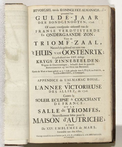
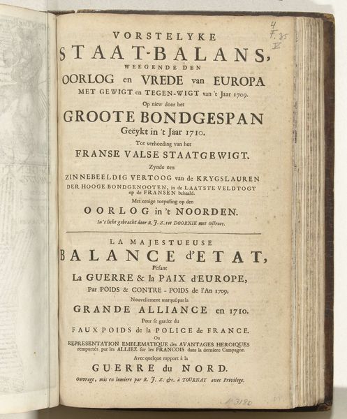
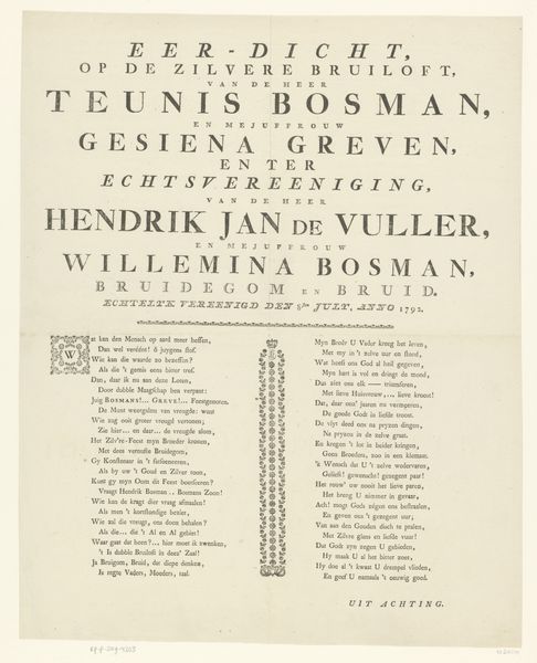
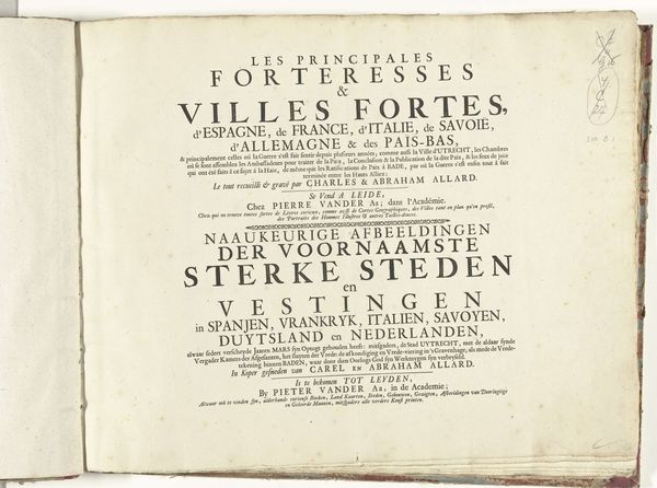
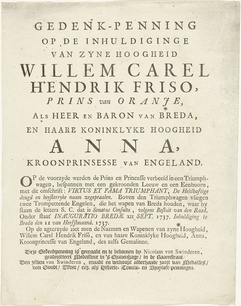
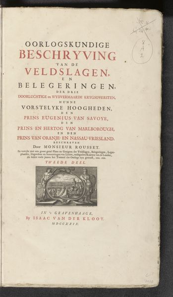
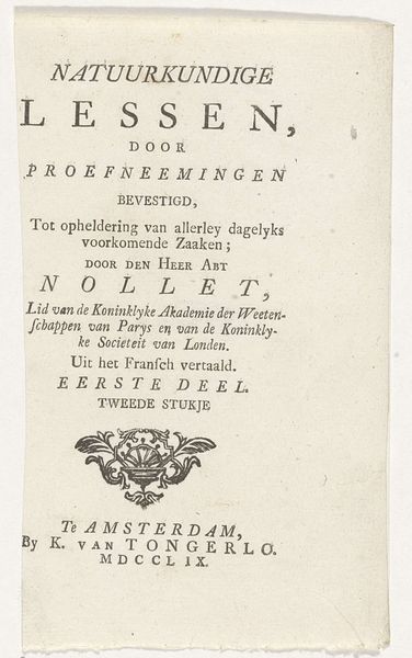
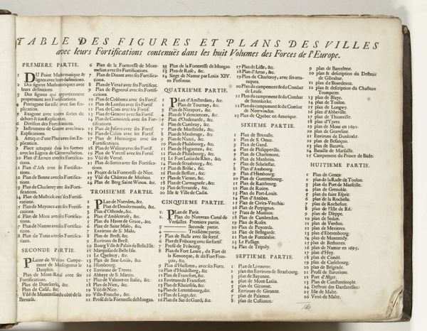
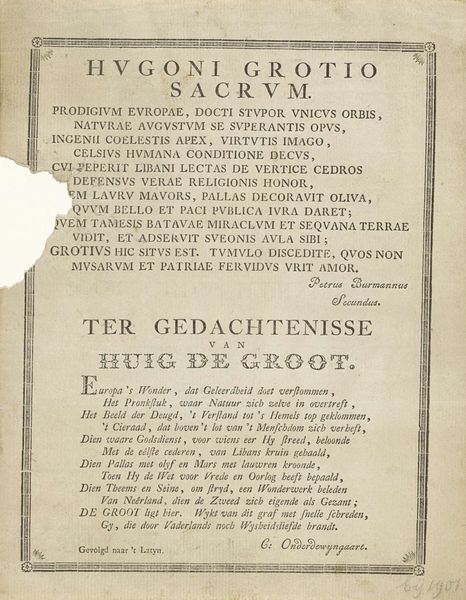
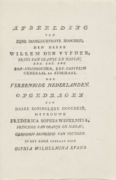
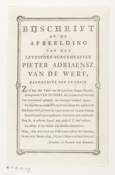
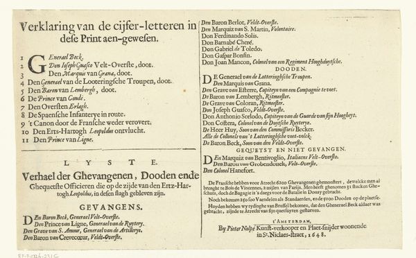
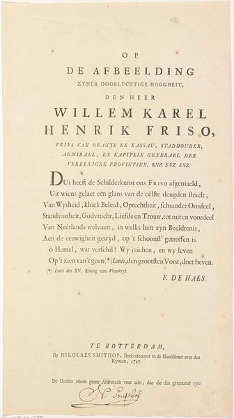
This is a text page from Henrich Ruse's "Versterckte Vesting," created in 1654 by Hendrick Baron van Ruse van Rysensteen. At first glance, one is struck by the stark contrast and rigid structure that defines this page. The dense, black lettering is starkly set against the off-white paper, creating a powerful visual rhythm. Each line, with its varied typefaces and sizes, is meticulously arranged. But what does this structured composition reveal? The hierarchy of names and titles isn't merely informative; it's a codified display of power. The use of specific fonts and the calculated spacing create a semiotic system, reflecting the social stratification of 17th-century Amsterdam. Consider how the text is centered, each name a pillar in the city's structure. The page functions beyond its literal content, instead, operating as a visual architecture that mirrors the very fortifications Ruse sought to strengthen. Ultimately, this page becomes a study in how typography can both reflect and reinforce the power dynamics of its time.
Comments
No comments
Be the first to comment and join the conversation on the ultimate creative platform.
