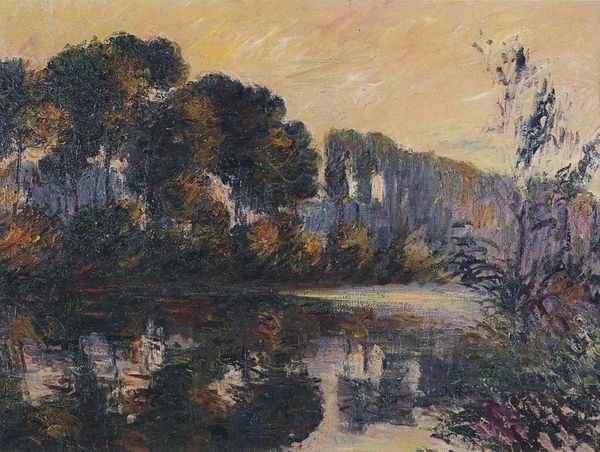
Copyright: Public domain
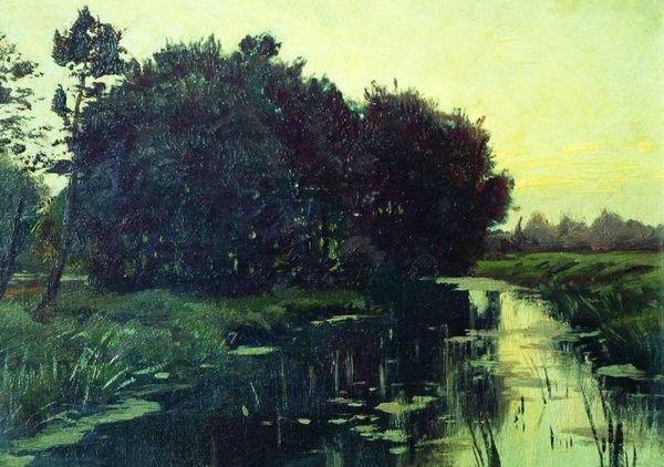
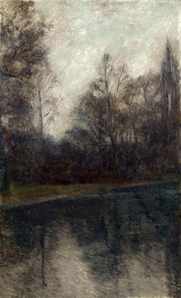
Lesser Ury painted "On the Channel" sometime in the late 19th century, probably using oils. The marks are soft and blended in a way that's almost blurry, and it's this quality that really draws me in. The colors are muted – mostly greens, blues, and grays, which creates a moody, atmospheric vibe. If you look closely at the water, you can see how Ury used thin washes of paint to create the illusion of reflection, while the boats themselves are rendered with thicker, more opaque strokes. The way the light hits the clouds? Divine! It gives this sense of fleeting beauty, like a moment captured in time. This feels like a close cousin to some of James McNeill Whistler's nocturnes, with its emphasis on tone and mood over detail. It’s like they’re both tuning into the same frequency, reminding us that art is often about feeling more than seeing.
Comments
No comments
Be the first to comment and join the conversation on the ultimate creative platform.
More like this