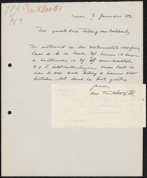
Brief aan jonkheer Hendrik Teding van Berkhout (1879-1969) Possibly 1932
0:00
0:00
louiscardinaals
Rijksmuseum
drawing, paper, ink, pen
#
portrait
#
drawing
#
pen sketch
#
paper
#
ink
#
sketchbook drawing
#
pen
#
calligraphy
Copyright: Rijks Museum: Open Domain
Editor: This is a letter, "Brief aan jonkheer Hendrik Teding van Berkhout," possibly from 1932, created by Louis Cardinaals. It seems to be made with pen and ink on paper. The handwritten quality gives it a very personal, almost intimate, feel. What strikes you when you look at this piece? Curator: I am struck by the formal interplay between text and image. Consider the contrasting weights of the calligraphic strokes. Note how some ascend rapidly while others maintain level footing; how the pressure of the ink disperses or remains constant. Also, consider how the ink interacts directly with the weave of the page to generate texture and shading that further articulates form and dimension. Editor: So you are not really focusing on what the text *means* so much as how it *looks*? Curator: Precisely. The linguistic signifiers here are almost beside the point. Observe, for instance, the confident flourish of the signature; a self-contained composition abstracted from its function as mere designation of the authorial presence. Do you observe the geometric shapes that contain the characters, like the "L" and "C"? What impact does that compositional constraint has on the overall unity? Editor: I do, and that really makes me reconsider how I first approached this letter. I was thinking of it as a message, but seeing it as a collection of shapes and forms and lines, quite separate from its meaning, allows a whole new appreciation. Curator: Exactly. In focusing on these qualities—the lines, forms, and textures, we unlock the letter’s aesthetic core. This approach allows us to value the image for what it presents, for how the medium and execution form visual elements, rather than simply as an indexical signifier.
Comments
No comments
Be the first to comment and join the conversation on the ultimate creative platform.
More like this