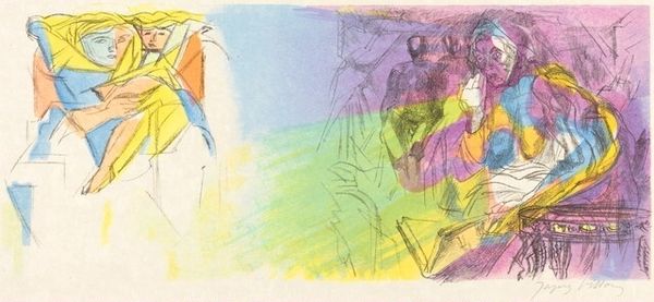
![Virgilius Maro (Title Page) [right] by Jacques Villon](/_next/image?url=https%3A%2F%2Fd2w8kbdekdi1gv.cloudfront.net%2FeyJidWNrZXQiOiAiYXJ0ZXJhLWltYWdlcy1idWNrZXQiLCAia2V5IjogImFydHdvcmtzLzg4ODQwMjVmLTAyNTEtNDMyYi05ZTcxLTVkZDhmZDFhYjU5NC84ODg0MDI1Zi0wMjUxLTQzMmItOWU3MS01ZGQ4ZmQxYWI1OTRfZnVsbC5qcGciLCAiZWRpdHMiOiB7InJlc2l6ZSI6IHsid2lkdGgiOiAxOTIwLCAiaGVpZ2h0IjogMTkyMCwgImZpdCI6ICJpbnNpZGUifX19&w=1080&q=75)
drawing, print, etching, ink
#
portrait
#
drawing
#
cubism
# print
#
etching
#
figuration
#
ink
#
linocut print
#
line
Copyright: National Gallery of Art: CC0 1.0
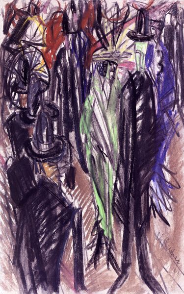
Jacques Villon made this title page, Virgilius Maro, sometime in the 20th century using etching, and color aquatint. What hits me first is the sense of the artist building up the image with layers of colored lines, a bit like weaving but with ink. The texture is smooth because of the printmaking process, but the lines create a visual buzz. The colors, mostly blues, pinks, greens and yellows, don’t blend so much as sit side by side, creating a kind of optical mixing. Check out the lower left corner, where the green and blue lines meet – your eye does the work of blending them. This relates to Villon's wider concerns with structure and form, but also perhaps a nod to Synthetic Cubism. This piece feels like a conversation between the artist and the material, a dance of color and line. It reminds me a little of how Josef Albers played with color relationships, always exploring how colors change depending on what’s next to them. Isn't it amazing how art can be both so precise and so open to interpretation?
Comments
No comments
Be the first to comment and join the conversation on the ultimate creative platform.
More like this