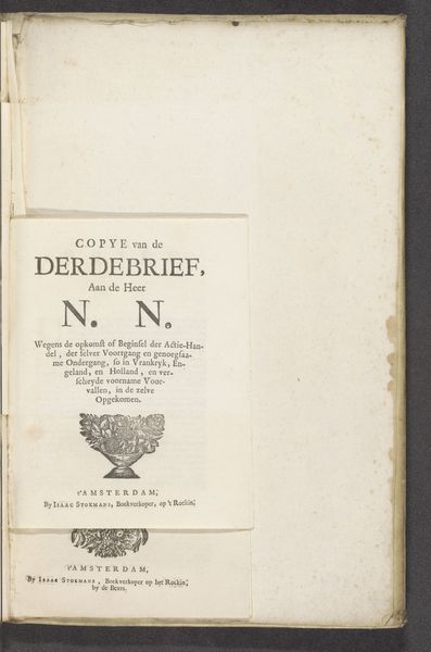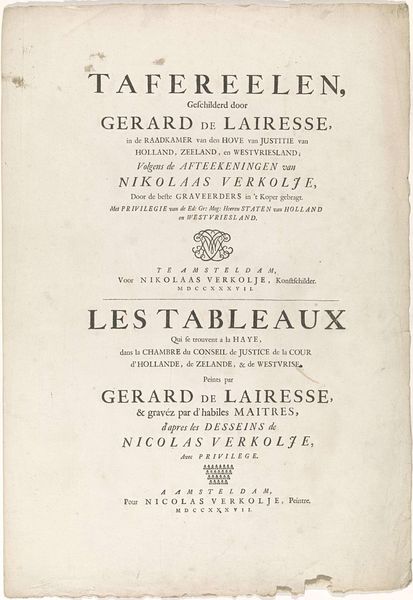
Titelpagina van: Uniformes des Gardes d'honneur, des différens corps dans les sept départements de la Hollande; formés pour la reception de Sa Majesté l'empereur et roi / Uniformen van de Gardes d'honneur van de onderscheiden corpsen in de zeven départementen van Holland; opgericht tot de ontfangst van zijne Majesteit den Keizer en Koning, Amsterdam, Evert Maaskamp, 1811 1811
0:00
0:00
evertmaaskamp
Rijksmuseum
print, paper, typography
#
dutch-golden-age
# print
#
paper
#
typography
Dimensions: height 385 mm, width 280 mm
Copyright: Rijks Museum: Open Domain
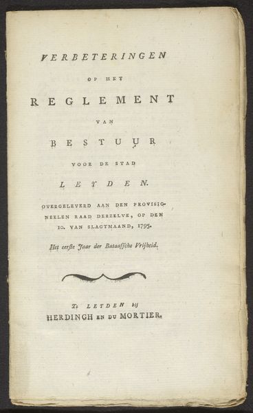
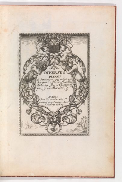
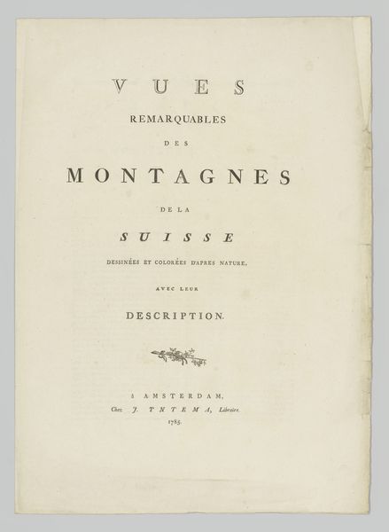
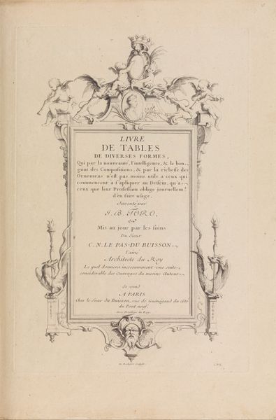
This is the title page of "Uniformes des Gardes d'honneur," created in 1811 by Evert Maaskamp in Amsterdam. The immediate impression is one of formal symmetry and hierarchical arrangement. Observe how Maaskamp uses typography as a structural element. The careful arrangement of text in both French and Dutch isn't merely informative; it’s a visual architecture. The differing font sizes create a clear hierarchy, guiding the viewer's eye from the grand title to the specifics of publication. The titles in French and Dutch mirror each other, reflecting a bilingual nod to its intended audience. The symmetrical layout is disrupted by the marbled endpapers visible on the right edge, introducing an organic, unpredictable element. This tension between the rigid text and fluid endpapers destabilizes any fixed interpretation, suggesting a dialogue between order and chaos. The page functions as a semiotic system, where typography and layout combine to communicate not just information, but also ideas of power, order, and cultural duality. Consider how this formal presentation mirrors the political context of the time, with its emphasis on protocol and imperial display. This title page doesn't simply present a book; it performs a cultural script.
Comments
No comments
Be the first to comment and join the conversation on the ultimate creative platform.
