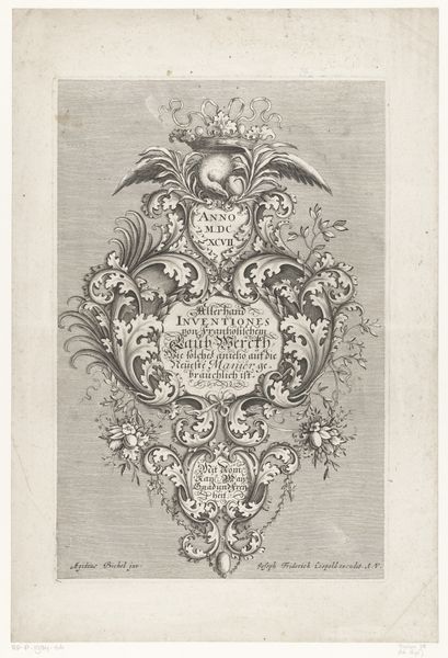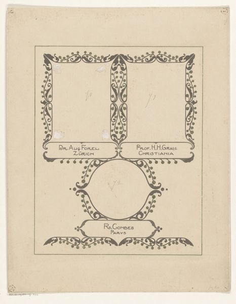
print, paper, engraving
#
portrait
#
baroque
#
ink paper printed
# print
#
old engraving style
#
curved letter used
#
paper
#
history-painting
#
engraving
Dimensions: height 391 mm, height 289 mm
Copyright: Rijks Museum: Open Domain
Curator: Welcome. Before us is “Wilhelmus de derde / Prince van Orangien,” a print, engraving to be exact, created between 1738 and 1767. It's housed here at the Rijksmuseum. What strikes you first? Editor: It has an intriguing roughness about it, almost childlike. The lines are simple, but the overall effect is quite dynamic. I'm drawn to the oval border and the figure mounted on the horse. Curator: The social context here is vital. Prints like this served as accessible forms of political imagery, widely disseminated. Consider the labor involved in creating the printing plates, and the networks of distribution—the workshops and markets where these images were sold and consumed. Editor: Indeed. The composition directs your eye immediately to the central equestrian figure, framed within that elaborate oval. Note how the use of line creates depth and movement. The colour palette is restrained and, at first, seems oddly random. Curator: Restrained? It’s deliberately patterned. The colours serve a propagandistic purpose, perhaps highlighting affiliations or loyalties. We should also note the materiality of the paper itself and its aged quality – showing both process and object making its creation significant. Editor: Perhaps "understated" is more fitting. Each colour is purposefully allocated to suggest shadow or emphasize details within a two-dimensional form. This speaks volumes of what constitutes the aesthetic intention here. The heraldic emblems at the upper right add a certain complexity. Curator: These emblems and text locate the work within a very specific historical and social sphere. It points to the growing commercial print market for this specific segment of Dutch society, and it reminds us about the materials, labor and consumption. Editor: For me, the appeal lies in the artist's adept manipulation of visual elements to guide the viewer’s gaze. A beautiful synthesis that communicates, whether we can decode all the historical and propagandistic symbols now or not. Curator: Absolutely, understanding its existence, from ink, labour, and market value allows for greater accessibility to what constitutes high art, allowing new considerations of consumerism, and the democratising ability art could offer during such periods. Editor: An analysis I would completely concur with. It truly illuminates the complexity that defines the creative sphere.
Comments
No comments
Be the first to comment and join the conversation on the ultimate creative platform.
