drawing, print, etching, ink
#
drawing
#
blue ink drawing
# print
#
etching
#
bird
#
ink
#
genre-painting
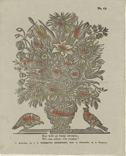
Dimensions: height 415 mm, width 335 mm
Copyright: Rijks Museum: Open Domain
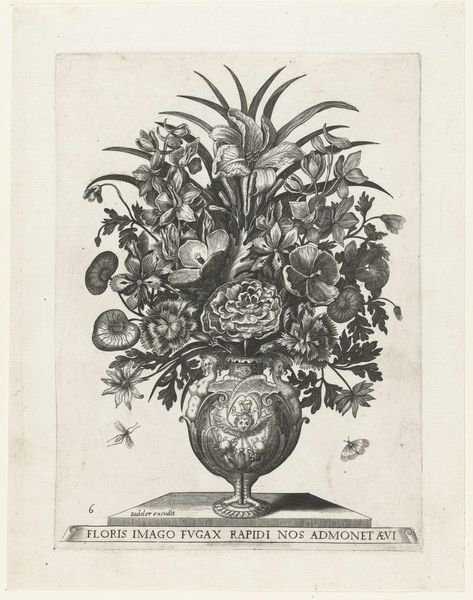
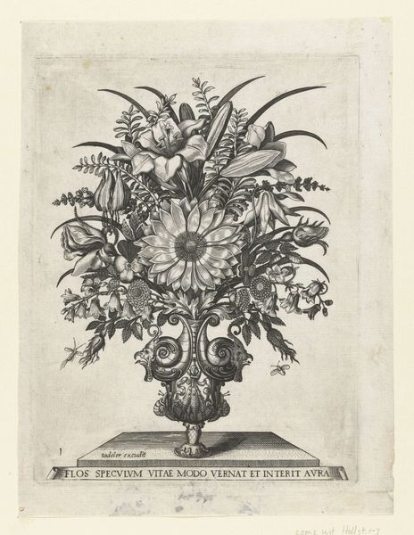
Curator: Here we have “Hier hebt gij fraaije bloemen; / Wie zou natuur niet roemen?” a print dating from around 1832-1850 by W. & J. Hissink. It's an etching with ink, portraying a stylized bouquet in a vase, flanked by two birds. Editor: It's...charming. But almost hauntingly so. The colors are so muted, a kind of blue and faded orange. And those birds – one pecking at something on the ground, the other looking forlornly upwards. What’s the overall effect meant to be? Curator: That's interesting, I think you are responding to what are rather standardized conventions of popular imagery. These kinds of prints were produced in quantity for the kind of petit-bourgeois market interested in domestic ornament, visual tropes on nature, and simple affirmations of piety and gratitude. That is made evident in the inscribed title below the vase which states “Here are fine flowers, who would not praise nature?” Editor: Gratitude. Yes, I suppose I was missing the point! But even in its piety, there's still that melancholy lurking. Maybe it’s just me, but those almost sickly colors suggest something faded, or past. Even nature itself feels somehow artificial, tamed within that ornate vase. Curator: These decorative prints would likely have had a different effect at their time. As a reminder of nature’s abundance for a population experiencing the environmental consequences of urbanization and industrial growth. And also remember the role of color in such prints, likely applied by workshop assistants as one part of the reproduction process. But indeed, the overall formality, with these neatly arranged blooms, contrasts starkly with the wildness they aim to capture. The placement of the two little birds introduces something of a genre painting. Editor: That helps me to place it in time, socially. Now I can almost imagine this print adorning the parlor of a modest home, offering a carefully curated vision of beauty and plenty. So I guess that hint of melancholy wasn't quite what the creators intended. Curator: Precisely. But your feelings toward the art are not necessarily 'wrong'! After all, as it circulates in culture across decades and centuries, we receive different messages from it based on where we find it, where it's kept, what we're seeing in the world at the moment of witnessing. I think it all counts. Editor: Right. I mean, who’s to say a touch of melancholy wasn't present even then, humming beneath the surface of the gratitude? Either way, the combination certainly makes for an intriguing image. Curator: Indeed! Thanks for your take on this little print, I found it quite illuminating.
Comments
No comments
Be the first to comment and join the conversation on the ultimate creative platform.
More like this