Copyright: Thomas Downing,Fair Use
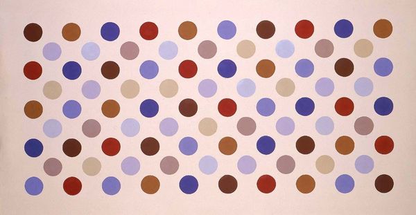
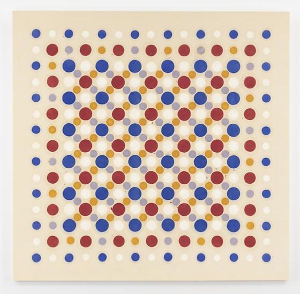
Editor: We're looking at Thomas Downing’s "Grid #9: Saranac" from 1971, rendered in acrylic paint. What strikes me is its simplicity, a collection of colored circles arranged in neat rows and columns. It has a very calming, almost meditative effect. How do you interpret this work? Curator: The impact of this work stems precisely from that structural rigor. Downing's use of the grid is not merely decorative. The grid, a fundamentally modernist device, provides a framework that allows for the exploration of pure color relationships, absent of narrative or representational concerns. Editor: So, the colours themselves are the subject matter? Curator: Indeed. Consider the carefully calibrated palette: the juxtaposition of primary hues – red, blue, and yellow – alongside the cooler tones and neutrals. How does that interaction of colours impact the overall composition, and your understanding of the work? Editor: I suppose it creates a visual rhythm. The repetition makes me aware of the subtle variations between the colours and even the size of the circles, which I hadn’t noticed at first. Does that relate to minimalism and colour field painting? Curator: Precisely. The repetitive pattern coupled with pure colour creates a plane of chromatic interaction, avoiding any illusionistic depth. In its materiality, flatness, and reductive form, the essence of "Grid #9" aligns with the minimalist pursuit of pure, objective visual experience. It becomes less about ‘what’ is depicted and more about ‘how’ we perceive. Editor: That’s fascinating. I hadn’t considered the active role the viewer plays. Now I'm appreciating how those formal elements, seemingly simple at first glance, invite such a complex and rewarding experience. Curator: It exemplifies the capacity of colour and structure to produce a profoundly moving aesthetic experience, absent any representational crutches.
Comments
No comments
Be the first to comment and join the conversation on the ultimate creative platform.
More like this