Copyright: Rupprecht Geiger,Fair Use
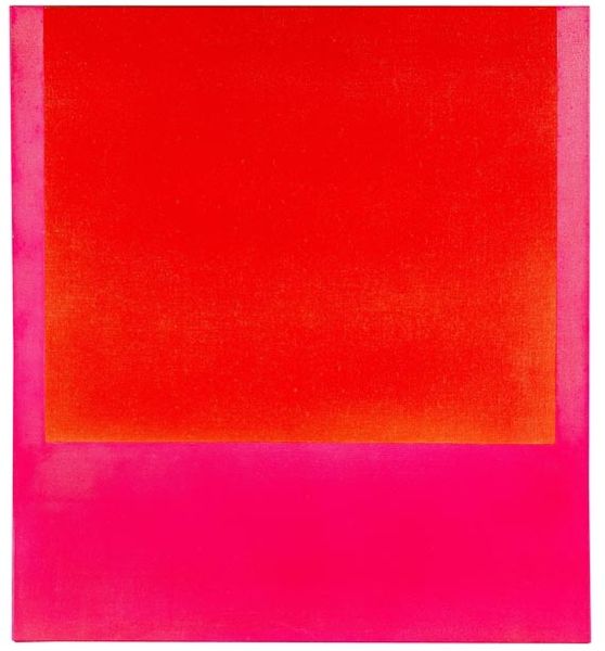
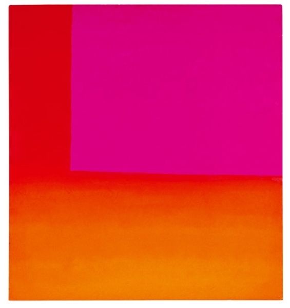
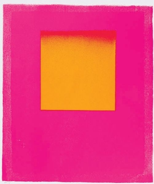
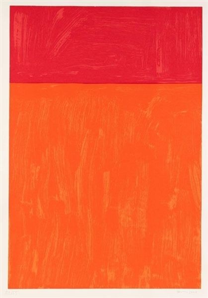
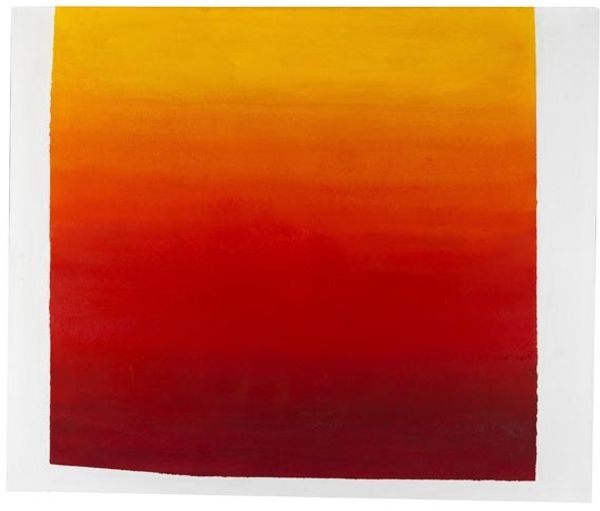
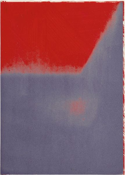
Rupprecht Geiger made this vibrant print with light red, orange, and what I'm gonna call hot pink. I'm really drawn to the way he used color as the main event. Looking closely, you can see the texture in the orange section at the bottom, like it was sprayed or dabbed on, which gives it this soft, almost hazy effect. It’s as if the color is floating off the surface, kind of shimmering. Then you have these blocks of solid color, demanding your attention. The contrast between the fuzzy, textural areas and the sharp-edged blocks creates a push-and-pull effect, it's a play between depth and flatness, between something solid and something dissolving. I see a bit of Josef Albers here, who was also obsessed with color relationships, but Geiger brings a certain looseness to it, an emotional vibrancy. It feels like he's inviting us to experience color as a living, breathing thing, always in flux.
Comments
No comments
Be the first to comment and join the conversation on the ultimate creative platform.
More like this