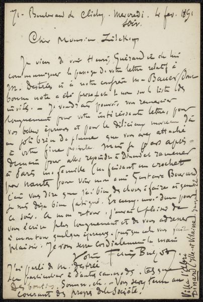
drawing, etching, ink, pen
#
drawing
#
impressionism
#
etching
#
ink
#
pen
Copyright: Rijks Museum: Open Domain
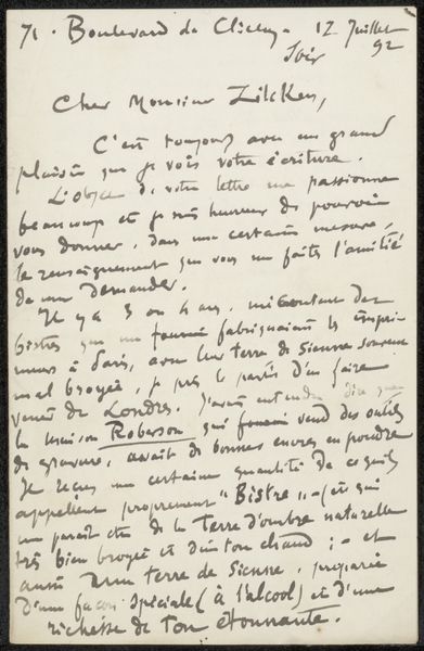
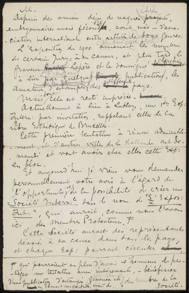
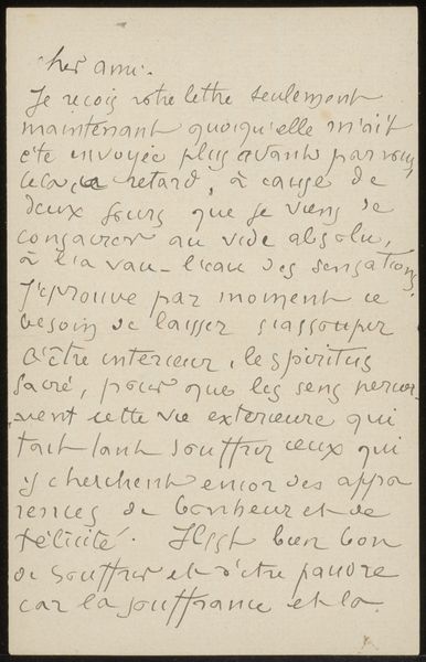
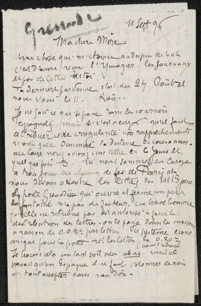
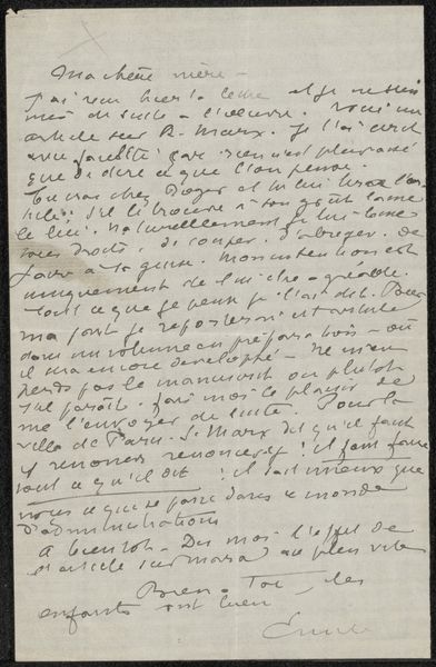
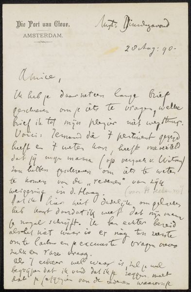
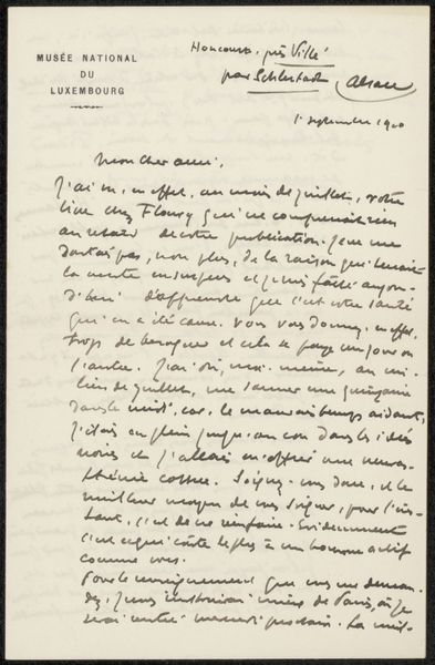
Curator: Here we have "Brief aan Philip Zilcken," a letter by Félix Hilaire Buhot, dating from between 1857 and 1898. The Rijksmuseum holds this piece which is an intriguing combination of etching, ink, and pen drawing. Editor: My immediate thought is that it resembles a faded dream, almost illegible, yet hints of Parisian streets and perhaps a yearning heart persist through the script. Curator: The letter's very existence provides insight into Buhot’s network and the importance of correspondence within the Impressionist art world. Sharing information, seeking support… letters like these were vital. Editor: There’s a wonderful immediacy in it, too. We’re eavesdropping on an artistic friendship, witnessing the thoughts and struggles as they flow from his pen. And did he design the script as part of the drawing, is every flourish meant or merely impulsive? Curator: It's worth considering the act of writing as a performance for an artist in this period. The style, choice of paper, and even the ink contribute to the image he wants to convey to Zilcken and subsequently his peers in Paris at the time. This very letter becomes an artwork! Editor: And don't forget the paper! He certainly gives himself to writing without much restraint. Curator: Indeed! By analyzing its tone, we can uncover more about their connection but also perhaps gauge something of Buhot's disposition, ambitions, and concerns, all of this reveals as much as any painting or etching, sometimes more so. Editor: It is exciting in this context that there are studies and maps of London there, Kennington and Chelsea. Almost like a souvenir! You know he might well be at a little table by the Thames as he scratches these thoughts to paper. The world condensed into the spidery web of ink! Curator: Exactly. These insights of place were valuable because that London connection was useful and in many cases profitable to Parisian Impressionists. The location becomes, in a way, a subject, but also a selling point. Editor: Right, an excellent addition to this conversation! It makes me appreciate the tactile quality of the letter and it is good for reflection. Curator: The beauty and power of letters lies indeed in what we can read on the surface but in what also lies subtly unsaid between the lines.
Comments
No comments
Be the first to comment and join the conversation on the ultimate creative platform.
More like this