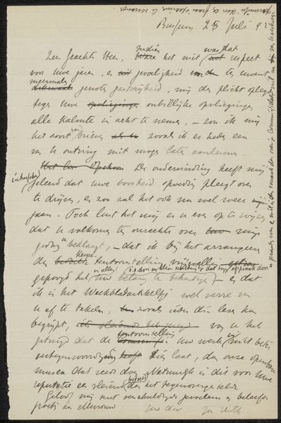
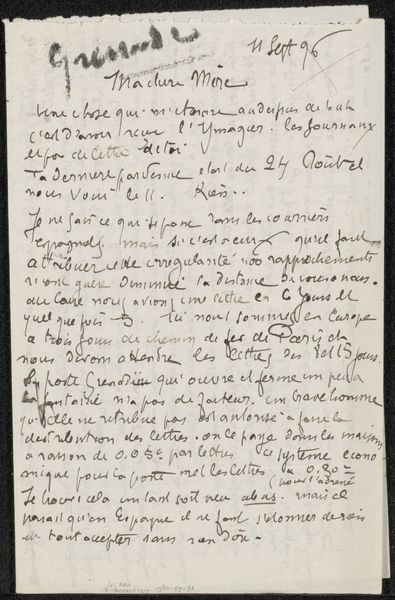
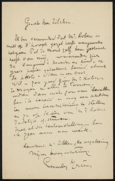
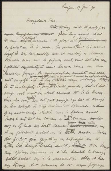
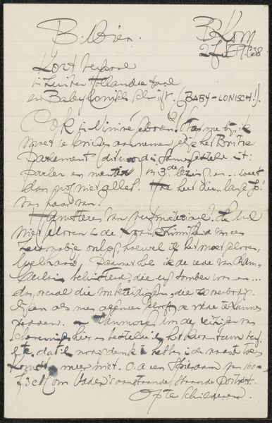
drawing, paper, ink
#
drawing
#
paper
#
ink
#
calligraphy
Copyright: Rijks Museum: Open Domain
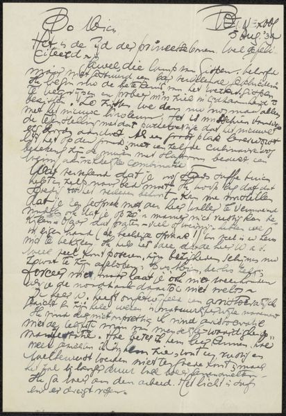
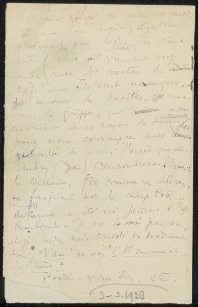
Editor: This intriguing piece is called "Brief aan anoniem," which translates to "Letter to Anonymous," created sometime between 1901 and 1925 by Philip Zilcken. It’s an ink drawing on paper, held at the Rijksmuseum. The density of the handwriting almost creates a visual texture, an abstract shape… it’s fascinating! What do you see in this piece, from a formal perspective? Curator: Indeed. It’s quite rewarding to approach this work primarily as a formal construction. Notice how the script isn't simply text, but rather a network of lines, almost woven together. Observe the variations in the ink's density and pressure – how they create depth and rhythm on the page. Editor: Yes, the lines are very rhythmic. They're controlled, but with a certain nervous energy. Almost musical! Curator: Precisely. It's crucial to examine the page's composition; note the empty spaces versus the densely filled areas. The negative space gives the eye a place to rest amidst this intricate web. Do you observe any areas where Zilcken might have altered the initial flow of the text? Editor: I think so…there are definite strikethroughs and corrections. They feel important somehow, almost as intentional marks. Curator: Exactly. Those are powerful because they direct attention to the choices Zilcken made in composing this piece. The cancelled words and revisions serve as reminders of the artistic process itself, making it a work about writing more than the writing itself. We must be cognizant of this effect as integral to the overall piece. Editor: That’s a brilliant point. I had been focused on trying to decipher the writing, but understanding it as an object… opens it up in a new way. Curator: I concur entirely. Examining the letter solely for its semantics diminishes the potency of this artwork as a confluence of script and art form. Editor: I’ll definitely look at handwriting differently after this. Thanks!
Comments
No comments
Be the first to comment and join the conversation on the ultimate creative platform.
More like this