About this artwork
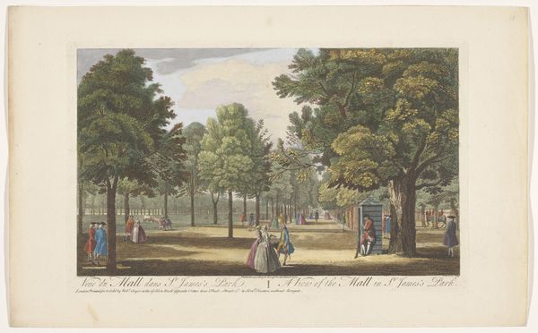
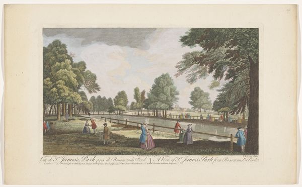
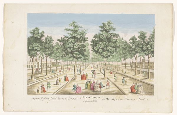
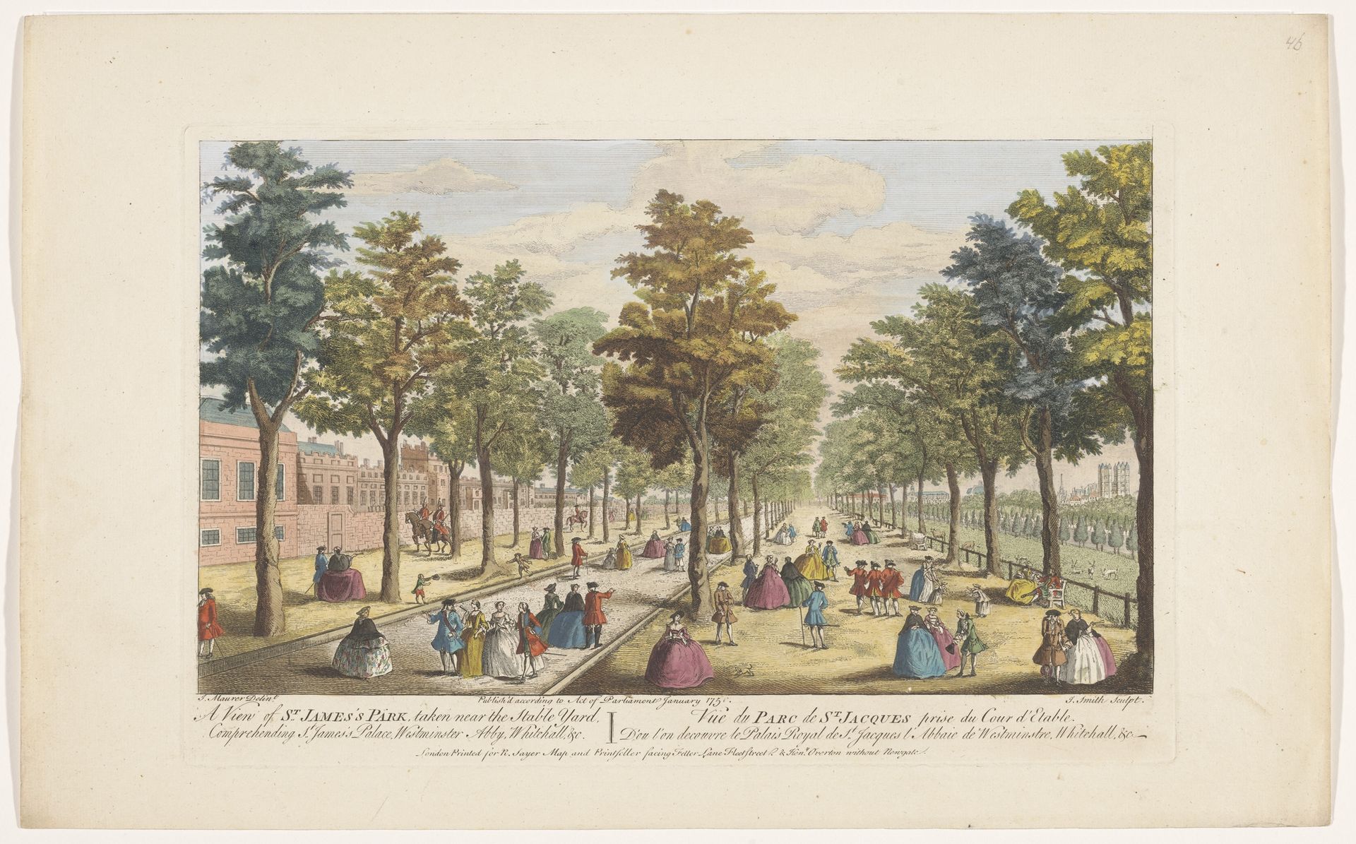
Editor: Here we have Robert Sayer’s “View of the Lanes in St. James's Park, London,” created around 1751. It’s a print, with etching and watercolor. The overall impression is quite charming, almost theatrical, but what really stands out is the receding perspective achieved through the avenue of trees. What do you see in this piece? Curator: Indeed. Focus first on the geometric arrangement. The strong horizontal lines created by the paths and the building in the background create a grounding effect. This is juxtaposed with the verticality of the trees, which punctuate the space and lead the eye towards a vanishing point. Consider the artist's command of line and how it directs our gaze and structures the pictorial space. Notice also the balance between positive and negative space, specifically, the detailed renderings of the figures versus the open sky. How does this balance contribute to the work? Editor: It creates a sense of depth, pushing the eye further into the scene and also contrasts busyness and quiet in an interesting way, perhaps representing society? Curator: Perhaps, but notice the repetitive use of curvilinear forms throughout: the canopies of the trees, the rounded shapes of the figures' clothing. These create a visual harmony. Now, how do you see this reflected within the lines etched and painted into the artwork? Editor: It’s like everything is intentionally placed in contrast, the figures seem carefully posed, to achieve compositional balance but, not realistic representation. Curator: Precisely. The figures aren't individualized portraits, but rather formal elements, much like the trees and the buildings themselves. They function to populate the scene but, crucially, they add depth through their contrast, tone, and careful use of colour. Editor: So, form and arrangement trump literal representation here? Curator: Precisely. Sayer has created an environment structured to be read and appreciated through an elegant and rigorous balance of shape, texture, and color. It prompts us to see beyond the literal view to find harmony in the artwork's form. Editor: I’ll never see landscape prints the same way! Thinking of it in terms of geometric balance helps unlock a lot more of the artist’s intent. Curator: Agreed. Considering the visual vocabulary is a potent lens.
Gezicht op de lanen in het Saint James's Park te Londen 1751
Robert Sayer
1725 - 1794Location
RijksmuseumArtwork details
- Medium
- print, etching, watercolor
- Dimensions
- height 262 mm, width 405 mm
- Location
- Rijksmuseum
- Copyright
- Rijks Museum: Open Domain
Tags
etching
landscape
watercolor
cityscape
watercolour illustration
genre-painting
rococo
Comments
No comments
About this artwork
Editor: Here we have Robert Sayer’s “View of the Lanes in St. James's Park, London,” created around 1751. It’s a print, with etching and watercolor. The overall impression is quite charming, almost theatrical, but what really stands out is the receding perspective achieved through the avenue of trees. What do you see in this piece? Curator: Indeed. Focus first on the geometric arrangement. The strong horizontal lines created by the paths and the building in the background create a grounding effect. This is juxtaposed with the verticality of the trees, which punctuate the space and lead the eye towards a vanishing point. Consider the artist's command of line and how it directs our gaze and structures the pictorial space. Notice also the balance between positive and negative space, specifically, the detailed renderings of the figures versus the open sky. How does this balance contribute to the work? Editor: It creates a sense of depth, pushing the eye further into the scene and also contrasts busyness and quiet in an interesting way, perhaps representing society? Curator: Perhaps, but notice the repetitive use of curvilinear forms throughout: the canopies of the trees, the rounded shapes of the figures' clothing. These create a visual harmony. Now, how do you see this reflected within the lines etched and painted into the artwork? Editor: It’s like everything is intentionally placed in contrast, the figures seem carefully posed, to achieve compositional balance but, not realistic representation. Curator: Precisely. The figures aren't individualized portraits, but rather formal elements, much like the trees and the buildings themselves. They function to populate the scene but, crucially, they add depth through their contrast, tone, and careful use of colour. Editor: So, form and arrangement trump literal representation here? Curator: Precisely. Sayer has created an environment structured to be read and appreciated through an elegant and rigorous balance of shape, texture, and color. It prompts us to see beyond the literal view to find harmony in the artwork's form. Editor: I’ll never see landscape prints the same way! Thinking of it in terms of geometric balance helps unlock a lot more of the artist’s intent. Curator: Agreed. Considering the visual vocabulary is a potent lens.
Comments
No comments